Friday, January 29, 2010

Erika & Eric Are Getting Married!


Happy Friday everyone! A couple of weeks ago I completed a lovely set of wedding invitations for a wonderful couple back east named Erika and Eric! Erika and Eric designed their wedding invitations together and hired Twin Ravens Press to letterpress print them! I love the simplicity and pure elegance of this lovely one-color suite. I occasionally have potential customers ask if letterpress printing will be beautiful in just a single color, or if they really need to do two or more to make the letterpress look outstanding. Well, ladies and gentlemen, here is a stunning example of a one-color letterpress suite that I think looks gorgeous and amazing! You can see the full suite at the top, which included a horizontal A7 size invitation with corresponding gold envelope, and a horizontal 4bar size reply card with corresponding red envelope.


Erika and Eric's wedding invitation and reply card were printed on Crane Lettra 100% cotton Ecru paper, which is a nice, warm color that really takes letterpress impressions well. As the groom has a chinese background, they chose the traditional wedding color for the Chinese culture: red, as their ink color. Erika and Eric used a gorgeous, decorative script face for their names and the "Dinner and dancing to follow" line of their invitation, and a nice, contemporary all-caps san-serif face for the rest of the text. They created two very pretty, ornate looking border elements for each side of the invitation, and included a traditional chinese double-happiness character in the bottom left corner of the design.


I love how that red ink just pops right off the page! It's truly stunning! We paired this invitation with a metallic, shimmery gold envelope from Waste Not Paper Company and printed the couple's return address on the flap in red ink.


Erika and Eric used many of the same design elements from their invitation for their reply card to keep the set consistent. We used the same red ink color for the printing and Erika and Eric continued using their lovely decorative script typeface and san-serif typeface, as well as the pretty ornate borders. Along with having the standard "accepts" and "regrets" lines on their reply card, they also included a section where guests could select their entree for reception dinner. These reply cards were paired with matching red envelopes that were printed with black ink, also from Waste Not Paper Company.


Aren't these just lovely?!? I absolutely love how traditional yet modern they are all at the same time, and I LOVE the splashes of red throughout the suite. It's such a great color! Erika and Eric were fabulous clients to work with and Erika told me she's heard nothing but glowing compliments on their invitations from their guests.

If you are interested in having a set of wedding invitations designed and/or letterpress printed by Twin Ravens Press, please contact me. I'd be more than happy to give you pricing and information on all of our design and printing services.

Thanks so much Erika and Eric! Congratulations and all the best to you!

Tuesday, January 26, 2010

Victoria & David are Married!


Almost eleven months ago (I can't believe it's been that long already), I wrote a blog post about a really fun and super-modern set of Save-the-Date cards I was printing for a couple in Texas who were getting married the following October. Well, as you all know, October 2009 has come and gone, and that couple that I made those Save-the-Dates for is now married! Shortly after completing their save-the-date cards, I went on to help them design and print the rest of their wedding stationery, which included an A7 invitation with corresponding envelope, an A6 size, folded thank you card with envelopes, a 4bar size reply card with corresponding envelope, and a really awesome, folded 6.25" square program for the actual ceremony. I enjoyed working with this couple quite a lot, and even though it's now after-the-fact, I wanted to make sure I shared all of their super-cool stationery with you!

You can see the pieces in the main invitation suite at the top of this post. And here is the invitation, all by itself:


Victoria and David's wedding invitations were an A7 size, printed in three ink colors: violet, chartreuse and light grey on Crane Lettra Bright White 100% cotton paper. I love how modern her design ended up being: very bright, very unique and super-modern. Victoria's Save-the-Dates, as well as the invitation you see above and the rest of the suite that you're about to see, were designed by her sister. Isn't that cool? I love how she used the different colors to separate all of the different little pieces of information. When text like this is so close and uniform, doing something like switching up the colors, will really help to set the most important information apart. We paired this invitation with a grey A7 envelope from Waste Not Paper Company and printed Victoria and David's return address on the flap in violet ink. I love how Victoria's sister kept the type styling consistent throughout everything in this suite, from big pieces like the invitation down to small details like the addresses.


Victoria and David's reply card was designed to coordinate and is a 4bar size, also printed in three ink colors. To mix things up, we paired this card with a coordinating chartreuse envelope and printed their address on the front in violet and grey inks.


When she ordered her invitations, Victoria also ordered a set of folded, A6 size thank you cards. I love the way that these thank you cards could be used as thank you's, but are also not specifically thank you cards and could also be used for other correspondence long after their wedding. The only printing on these cards is a simple, letterpress design of their names, printed in the same three ink colors as the rest of their suite. The cards are blank on the inside so Victoria and David could write whatever message they wanted to! Although not pictured, these cards were also paired with grey envelopes from Waste Not Paper that were printed with a violet return address on the flap.


Last, but certainly not least, Victoria and David hired me to design a program for their ceremony that would compliment the rest of their wedding stationery. They had quite a bit of information to include in the program, so we chose to create a 6.25" square, folded program on a single sheet of paper that had printing on all four panels. Here is what it looked like closed, from the front:


For the front of their programs, I tried to keep the design consistent with the design that Victoria's sister had created for their invitation. This is basically a "cover page". Open up the program and you will reveal all of the information about the actual events of Victoria and David's wedding ceremony.


This interior portion of the program included an order of events, as well as information on all of the music that was played and on the blessings and passages that were read and performed during the ceremony. The back page included information about Victoria and David's wedding party and an "In Loving Memory" section to acknowledge their family members who had passed away prior to their wedding.


Here is another image so you can see both sides of the program opened up and together:


I love how fresh, modern and unique this set of wedding stationery was! I also love how we were able to incorporate three very distinctive and unique colors into all the pieces, while keeping everything looking consistent! Victoria and David were fabulous clients to work with and I hope that their wedding this past October was as fun as their stationery!

Congratulations you two and thanks again!

Friday, January 22, 2010

Mini Promotional Notecards for In The Now Weddings


Are you getting married in Orange County, California this coming spring, summer or fall? If the answer is yes, you really ought to contact Amanda Auer, the owner and wedding planner behind In the Now Weddings and Events. Amanda contacted me back in August of last year because she was holding a special party to promote her business and wanted some really special and unique favors to hand out to her guests. What Amanda desired was to create a set of letterpress-printed, modern, 3" square, folded notecards with envelopes in sets of 5, with different love-related quotes on them, that guests could take home. I thought it was a really sweet idea! Amanda came up with the quotes and the design and Twin Ravens Press did the letterpress printing! Here are all five, sweet, mini-notes together. Click on the picture to make it larger if you'd like to read the quotes.


I love the modern style of these sweet, little cards and I love how Amanda made them coordinate with the look and branding of her business. Each card measures 3" square, when folded, and was printed with black ink on Crane Lettra Bright White 100% cotton paper. The quotation was featured on the front and the In The Now Weddings logo was featured on the back. Each card came with a coordinating white envelope.


Isn't this an awesome idea for a promotional giveaway?!? I love it! It's way better and more memorable than ordering something generic as a promotional item, like magnets or pens. Here are a few more images so you can see the cards closer.


So cool! Working with Amanda was a real pleasure and I imagine hiring her to coordinate a wedding or event would be equally rewarding. I hope she and I get to work together again in the future!

If you are interested in having a custom promotional card or other letterpress printed favor created for your business, wedding or upcoming event, please contact us. We'd love to talk to you about your ideas!

Thank you so much Amanda! Keep up the great work!

Thursday, January 21, 2010

Custom Business Cards: Mark Aikens


One of my favorite things about owning and operating a letterpress shop is getting to work with a variety of very talented and incredible graphic designers in and around Eugene, as well as across the nation. At Twin Ravens Press, we do a vast majority of our design work in-house, but I always welcome the opportunity to work with outside designers and artists who are looking to have their designs or designs they are creating for their clients letterpress printed.

Back in October, I was contacted by one such, very talented, graphic designer, in Eugene who was working with a client to create a set of really unique business cards. The designer, Mary Susan Wheldon, had met me at a local Meet Your Maker Show, where I was selling letterpress greeting cards. Mary Susan saw my work and was interested in working with me to letterpress print design work for her clients. The cards you see above and below were our first collaboration.

Mary Susan's client, Mark Aikens, makes and installs hand-cast, original wall papers with original stone textures. I've never actually seen any of Mark's work in person, but from the photographs that Mary Susan showed me, his work seems truly beautiful and absolutely a labor of love. Mary Susan wanted the business cards she was designing for Mark to reflect his artistry, ingenuity and the awesome texture and colors that are present in his wall papers. She figured that in order to convey this texture, letterpress printing might be her best choice. I agreed.


Mark's business cards are just a smidgeon larger than a standard 3.5"x2" business card size. The design features a column on the left hand side featuring six "bars" of color, all the same width, but in different lengths. These simulate single sheets of Mark's handmade wallpaper. The cards were printed on 220 lb. Duplex Crane Lettra 100% cotton paper in Pearl White for a super thick, lush impression and a very stiff, substantial card. We printed five of the six bars on the left hand side in a sparkly metallic copper ink and printed the sixth bar, as well as all of the text in a light, crisp blue. The thick cotton paper combined with deep letterpress imprints made for an already amazing texture, but to add something even more unique and special, we ran these cards through the press a third time and blind embossed a stone-texture pattern that Mary Susan created over the top of the metallic copper bars. Click on the above image for a larger view. This was a challenging effect to create, but the results are absolutely stunning!


If you're looking for a fabulous free-lance designer to work with in the Eugene/Springfield, Oregon area for an upcoming project, and you like Mark's cards, contact Mary Susan. She's amazing, has some fabulous ideas, and has an ever expanding portfolio that includes designs for a variety of items from business cards, logos and corporate stationery to books, posters, and invitations.

And, if you are looking in to having some gorgeous, custom wallpaper made for your home or business in Eugene or Springfield, contact Mark Aikens, who's information is on the business cards in the pictures. Like I said before, the pictures I've seen of his work look amazing!

Lastly, if you're interested in having your very own set of letterpress business cards designed and/or letterpress printed, contact us for more information. We would love to work with you!

Thanks again Mark and Mary Susan!

Monday, January 18, 2010

Tara & Jeremy are Married!


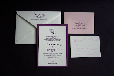
Last summer I had the pleasure of creating a wedding invitation suite for a lovely couple in Virginia who were married in late September of last year in Bel Air, Maryland. The bride, Tara, had seen this invitation suite that I printed for another couple earlier that year, and wanted to do something similar, but different, for her own invitation suite. Tara and Jeremy's suite featured an A7 size wedding invitation, a 4bar size reply card and coordinating envelopes for both pieces. You can see all four items in the suite in the photo above.


Tara and Jeremy's invitation was printed in one ink color: a nice reddish-purple that was mixed to coordinate with an invitation matt the we created to frame their invitation. The actual invite itself was printed on Crane Lettra Pearl White 100% cotton paper to create a really beautiful texture and impression. Check out the close-up:


For the design we created a simple, yet lovely monogram at the top using letters from the same typeface that we used for their names. For the rest of the text, we used a classic, all-caps, serif typeface.

Tara and Jeremy's invitation envelopes were also Crane Lettra. They had a traditional pointed flap and were letterpress printed with the couple's return address on the flap, also in purple ink.


For their reply card and envelope, we pretty much stuck with the same design as the reply card in the suite I linked to above, but we changed up the colors and information, just a little bit.


The reply card is a 4bar size, printed in light pink ink on Crane Lettra and features a bird with a banner at the top that has their reply by date on it. Below the banner detail is a line for the guests to write in their names, and options to accept or decline. Right below those options, Tara had us include a line with her and Jeremy's wedding website information, so guests could find out more about wedding details, accommodations, etc. there. We paired this card with a very light pink envelope, also printed with the return address in purple, from Green Paper Company.

I thoroughly enjoyed working with Tara and Jeremy and I hope their wedding this past September was just as sweet as their invitation suite! Congratulations Tara & Jeremy!

Thursday, January 14, 2010

Robot Coasters Featured on Ruthie Designs!


Our very cute Robot with Heart Coasters were featured this morning over on Ruthie Designs Blog! I just checked out her blog, and the author, Kim, features all sorts of awesomely designed items: everything from tea cups and pillows, to wall decals, fashion accessories and furniture. Mmm... tasty design! Go check out the feature here. And, if you'd like your very own set of Twin Ravens Press robot coasters, they are available in our etsy shop. Go check them out here.

Wednesday, January 13, 2010

Shanley & Christopher are Getting Married!


Check out this elegant set of wedding invitations that were recently completed for a lovely couple in the Atlanta, Georgia area who are having a destination wedding in Colorado this coming April. Shanley and Chris are having a lovely, early spring wedding in the Vail, Colorado area where they will wed and hope to enjoy some spring skiing! Their invitation suite includes an A7 size invitation and an A2 size reply card, both printed in one ink color (chocolate brown) with blind embossed details and envelopes to go with each! Check out the whole suite at the top of this post.

Here is Shanley and Chris' invitation all by itself.


Shanley chose a simple, classic serif typeface in all caps for the main text of her invitation and we used a slightly more decorative script face for the couple's names, which were featured prominently in the center of the invitation. We kept the design fairly simple, but created a lacy, blind embossed border around the names to set them apart from the rest of the text. It wasn't my original intention, but I think that the lacy pattern reminds me somewhat of a mountain range, like where Shanley and Chris will be holding their wedding, as well as formal lace, like on a wedding gown, at the same time. I just love the way clean, crisp letterpress printed type sinks into 100% cotton paper. Check out these detail photos to see it for yourself:


Isn't that just lovely? We paired the invitation with a matching A7 size envelope from Crane & Co. in Pearl White and created a custom liner for it in a shiny eggplant purple, fabric-weave paper. It's difficult to see from the photograph, but I love the way the purple liner adds an extra splash of color to this white and chocolate brown invitation suite.


We then letterpress printed Shanley's parent's return address on the flap of the envelope.


Shanley and Chris' reply card was designed to coordinate with the invitation. In order to do this, we enlarged part of the lacy, blind-embossed pattern from the invitation and placed it at the very bottom of the card. We then used the same fonts to create spaces for guests to respond to both Shanley and Chris' actual wedding ceremony as well as to their Aprés Ski event which will be held the day after.


Isn't the blind embossing extra pretty when enlarged? I really like it. Here are some more details of the reply card so you can see the fonts, blind embossing, impression, etc. a little bit better.


This card was paired with a coordinating A2 size envelope with Shanley's parent's address printed on the front. We had originally wanted the reply envelopes for these to also be from Crane, but a mix up with the supplier over the holiday caused us to have to choose another envelope from a different company. This wasn't the easiest mix-up to deal with, especially right after my accident, and we couldn't find an exact match, but the one we found was mighty close. Check it out:


Having to choose an alternate brand for this last piece wasn't the most optimal situation, but Shanley and Chris were really wonderful with the whole situation and the suite turned out gorgeous just the same!

Thanks so much Shanley and Chris! I know your wedding in Colorado is going to be fabulous and really really fun all at the same time. Congratulations to you both!