First off, to everyone out there reading this blog who have sent well-wishes and nice e-mails since I posted about my accident, thank you so much! You guys are wonderful. The recovery has been slow, and admittedly, I'm not used to being able to do so little, so it's been a little frustrating, but it is coming along and I am feeling a bit better day by day. Thanks so much for worrying and sending your best wishes!
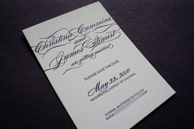
As of today I'm going to try to get back to our regularly scheduled blogging, starting with this lovely set of Save-the-Date cards that were designed and printed for a lovely couple in Virginia who are getting married in Washington DC this coming May. These Save-the-Dates were completed shortly after Christmas. Christina wanted a simple, yet beautiful design featuring only gorgeous typography using one of her wedding colors: Aubergine. For this design, I took advantage of some of the lovely flourish elements in the script font that Christina chose for all of the decoration around their names. Both the Save-the-Date card and square-flap envelope are an A6 size, which measures 4.5"x6.25". You can see both pieces together at the top of this post.
Here is the Save-the-Date card by itself. These cards were printed with a deep, aubergine purple ink on Crane Lettra 100% cotton Pearl White Duplex paper. The duplex paper is twice as thick as the standard weight of Crane Lettra that we normally use, making these cards super thick and substantial. For the design, I wanted Christina & James' names to be the most prominent element of the design, so I chose a very decorative script face that came with a bunch of different flourish options to decorate and embellish the characters with. We also used this same font for the date, but without as many flourishes. For the rest of the text we chose a simple and modern san-serif face to create a nice contrast and make that script stand out even more. Isn't it elegant?!? I love the way that a design like this really just sinks into the paper with lovely, tactile impressions from the letterpress process. Here are some close-ups so you can see the texture and script a little better:
Beautiful! Don't you think? For the envelopes, we created a return address to letterpress print on the flap that complimented the design of the actual cards. We used the same flourish-y script face for Christina and James' names and the same san-serif face in all caps for the actual address. Christina and James' envelopes are A6 size, square flap envelopes also by Crane & Co in Pearl White. Here is a close-up of the address on the envelope flap.
I absolutely love how this set of Save-the-Date cards turned out! Christina and I are currently working on the designs for her actual invitations and I can't wait to see what we end up coming up with for those! If you like her Save-the-Dates, keep an eye on this blog over the next few months to see the rest of her invitation suite!
Thanks so much Christina & James!


No comments:
Post a Comment