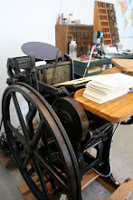
Let's take a look at each of the pieces in Caroline & John's suite individually!
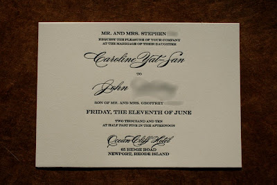
Here is their wedding invitation. All of the pieces in Caroline & John's suite were printed on beautiful, cream, Rives BFK printmaking paper. This paper is 100% cotton and has a very smooth, hot press finish and it holds a letterpress impression and fine lines beautifully. We chose a very formal layout and fonts for the invitation design and printed it in one ink color: black. I've said it before and will say it again: I absolutely LOVE how crisp, black ink on an all-text invitation looks letterpress printed onto fine 100% cotton paper. There's really nothing else like it and it is oh so classy! Check out a closer detail of the typography and printing:
Caroline & John chose a lovely, shimmery yellow-gold envelope from Waste Not Paper Company as their invitation envelope.
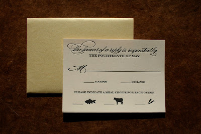
Caroline and John's reply card is a standard 4bar size and also came with a coordinating yellow-gold envelope. This piece was also printed in black ink on Rives BFK and we continued using the more formal, classic fonts that we had picked for the invitation in order to carry the style all the way through the suite.
When I originally sent Caroline samples of some other invitations that we had printed in the past, she mentioned really liking the use of icons to represent meal choices for guests, rather than writing out the meal choices in words, so we used this same idea for her reply card as well! As you can see in the above images, Caroline and John's reply card features the reply-by date at the top, a line for the guests to write their names, a place to check whether or not they will be attending the wedding and then below that is the question regarding meal choices. Each meal choice (fish, beef or vegetarian) has a line next to it for the guest to write in initials of who wants what entree. I love doing this on reply cards and think it adds a little extra whimsy to an otherwise very traditional reply card.
Like many couples I work with, Caroline and John have a wedding website where guests can locate more information about their upcoming wedding, directions, information about where to stay in Rhode Island, etc. In order to inform guests about their website, Caroline and John had me create a small (business card-size) website card featuring just the URL of their wedding website.
As with the other pieces, we still kept with the same, formal design and fancy typography. I think this is a lovely way to share your website with your guests!
To tie the whole suite together (literally) we created a belly band to coordinate with the suite. This belly band was made from 1/4" matching, yellow-gold ribbon from Waste Not Paper, and a custom, letterpress printed, 2.5" round medallion.
I've created belly band medallions like this for wedding invitation suites in the past and typically they feature the couple's initials and/or monogram, but for this particular suite, Caroline wanted to use the Chinese double-happiness character on her medallion instead. This symbol, as well as the color red, is very traditional and significant for Chinese weddings, and I thought this was a lovely way for Caroline to incorporate it into her suite.
Here is what the suite looked like all put together:
The various pieces were stacked, largest to smallest, with the double-happiness belly band tying everything together. I love the way the whole "package" looks - it's formal, beautiful and absolutely elegant. I also love the way the belly band keeps all of the pieces together, just so, so that the above is what the package looks like when it is pulled out of the envelope.
Gorgeous! I'm so glad I got to help make Caroline and John's invitations and vision a reality! I know their wedding this June is going to be absolutely elegant!
Congratulations Caroline & John!


No comments:
Post a Comment