Thursday, February 25, 2010

Out of Town


To all of my wonderful clients and readers: I wanted to let you know that I am going to be out of town this week, Thursday (today) through Sunday. I am traveling to Minneapolis to go to one of my younger cousin's weddings. This trip is both kind of exciting and making me a little nervous, because I haven't seen this particular part of my family for 15 years. I spent a little bit of time last weekend going through some old photos and found the photo at the top of this post. This photo was taken during the summer of 1995, which was the last time that I saw any of them in person. I'm the girl in the pink shirt on the far right, and was 11 years old at the time. My cousin Heidi who is getting married on Saturday is the one standing right behind me in the plaid shirt and overalls. She was 9 when this photo was taken, and the other three girls are also cousins who are in Minneapolis, who I will get to see at the wedding.

Aside from seeing my family that I haven't seen in a while and attending Heidi's wedding, I'm hoping to do some awesome Minneapolis work-related things while I am there, including meeting the uber-talented calligrapher/illustrator/designer, Crystal Kluge, in person. Crystal and I have been working together for a little while now on a few different collaborative projects including a few wedding invitations suites and some really cute holiday gift tags this last Christmas, but have never actually met in person, so I'm super-excited to finally meet her! (Click on the tag at the bottom of this post to see some of these projects! They are awesome!) A trip to one of the letterpress studios that I idolize, Studio On Fire, may also be in order, as they are located in Minneapolis as well.

If any of you out there are waiting to hear back from me on a print job or design work, or have recently made an inquiry about my services, I will be back to work on Monday morning (March 1st) and will answer your e-mails as soon as I can! Wish me luck and have a great weekend!

Wednesday, February 24, 2010

Stalked: Origami Crane Cards Featured on Etsy Stalker!


Stalked!

I received a lovely e-mail this morning that our Origami Crane Cards were featured on Etsy Stalker yesterday. Check out the feature here and the cards in our etsy shop!

Tuesday, February 23, 2010

Fabulous Eco-Friendly Business Cards for Trees Creation & Happy Grow Lucky


A few months ago I created a couple of lovely sets of business cards for a wonderful client and good friend, Teresa Ennis. Teresa is a business owner two-times-over, and wanted brand new, totally awesome business cards for both of her businesses. Both of her businesses are somewhat nature-oriented in one way or another and we wanted to really express that in her branding and in the design and execution of her cards. Here is what we came up with:


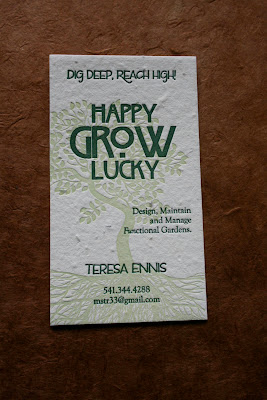
The first of Teresa's businesses is called Happy Grow Lucky, a local landscaping business she runs here in Eugene. I loved her business name as well as her tag line: "Dig Deep, Reach High!". For the design of this card we used a gorgeous tree image that has tons of roots spreading out across the bottom of the card. The trunk and branches of the tree twist around moving up the card vertically and accent the shape of the logo I created for her. The tree was printed in a very pale green and all of the typography on this card was printed in a darker evergreen color. These cards were printed on a custom seeded cream paper from Porridge Papers that will actually grow wildflowers if the paper gets wet. How cool is that?!?

I'm pretty proud of this design: it's perfect for Teresa's business and the whole concept really just kicks ass.


Besides having tons of talent for landscape design and making things grow happily, Teresa is also a talented artist. She creates everything from hand-bound books and journals, to jewelry, to found object art pieces. Her shop, Trees Creation, is up and running over on etsy. Go check it out by clicking here. Teresa's Trees Creation cards were also printed on cream colored Porridge Paper with wildflower seeds, this time in three ink colors: chocolate brown, green and plum purple. We continued the tree theme for this card, but created a different tree image and used some different fonts. Check it out:


Aren't they pretty? I just love how we can take the tree theme and create two business cards that are totally different, with a lot of the same elements. Below are a few detail photos of the Trees Creation cards so you can see the letterpress impression, ink colors, fonts and the details of the lovely Porridge Paper a little bit better.


Make sure to go and check out Teresa's etsy shop, and if you're in need of any landscaping in Eugene, give her a call at Happy Grow Lucky. Thanks so much Teresa! You are awesome!

Saturday, February 20, 2010

Love is Sweet: Leia & Tyler are Married (continued)!


(Photo Courtesy of Emily G Photography)

Last weekend I posted some pictures of one of my favorite stationery suites that was created for one of my favorite couples from 2009, Leia & Tyler. Not too long after their wedding, Tyler sent me a link to some of the photos from their special day. They gave me permission to share them with you here, and I am stoked to do so! I'm also excited to show you the awesome favor boxes I letterpress printed for their wedding, as well as their thank you cards that we printed just last month.

Let's start with the photos though! Leia & Tyler's photographer was the fabulous Emily of Emily G Photography in Portland, Oregon. I don't know Emily personally, but I do enjoy reading her blog, and ironically enough, she was the photographer for another friend's wedding, who I did stationery for, that was held the weekend before Leia & Tyler's wedding. If you'd like to see that couple's stationery (Emily & Stephen), as well as photos from their wedding taken by Emily G, check it out in my earlier post here.

I love the photos that were taken of Leia, Tyler and their ceremony on the beach! It was such a gorgeous, sunny day too for an Oregon wedding in October! They were really lucky!


I love Leia's green shoes in the foreground in this photo - so cute!!


Aren't they just an adorable, couple?!? And, here are a couple of photos of a few details from their reception:


(All wedding photos above courtesy of Emily G Photography)

See that last photo of all of the brown and light green boxes? Twin Ravens Press totally made those. These were kind of a last-minute project that we did the week before Leia & Tyler's wedding. You see, there is this great little chocolate shop in Eugene called Euphoria, and for their wedding favors, Leia & Tyler had gotten some really tasty little confections for their guests. They hadn't figured out yet though, how to package or display them at the wedding. Leia and Tyler contacted me to help them out with this last little detail. To package their chocolates as favors for their guests, we created a set of paper pillow boxes with a paper band around them, letterpress printed with Leia & Tyler's names, wedding date, and the phrase "Love is Sweet". The chocolate brown boxes were from Waste Not Paper Company, and measured approximately 6.25" x 4.125" x 1.625". Since we did this project on such short notice, you might notice that the font we used for it is a little different than the one we used for their invitations. Because we didn't have time to have a new printing plate made, I used antique metal type for the wording on their favor boxes and we cut one of the trees from one of their other printing plates out and combined it with the antique type to create the design. Pretty neat, don't you think?!? Here is what the boxes looked like flat:


And above is what they looked like folded up, with chocolate inside. Pretty sweet favors, if I do say so myself.

Then, just last month, I had the pleasure of working with Leia & Tyler again to create some custom thank you cards. Before I met Leia & Tyler they had created a set of Save-the-Date postcards themselves using photographs they had made of each other spelling out the words "Save the Date" on the front, and a photo of their two dogs, Vigo & Turbo, with signs that had their wedding date on them, and other information on the back. I don't have one of the actual cards they sent, but here is a screen shot of the Save-the-Date design.


For their thank you cards, Leia and Tyler wanted to return to the idea of using their dogs for some sort of cute, quirky, thank you image. Here is what we came up with:


Leia & Tyler's thank you's are an A2 size card, printed on Crane Lettra pearl white 100% cotton paper, with matching Crane Lettra square flap envelopes. For the design, I created a stylized, cute, cartoony image of Turbo and Vigo for the front, with signs around their necks, just like Leia & Tyler's Save-the-Dates, only this time, the signs read "Thank You", instead of the date.


Coming up with this image was really a collaboration between Tyler and I, to make sure that the eye spots and facial expressions came out just right. The words "Thank You" are also in Tyler's handwriting, just like the handwriting details from the directions card in he and Leia's invitation suite. Aren't these thank you's just adorable?!?

For the envelopes, we kept things nice and simple, and just went with a matching white envelope, and printed Leia & Tyler's return address on the flap in Turbo's eye-spot-color-tan.


Leia & Tyler were fabulous, super-fun clients and have become great friends. I can't wait to see what other non-wedding-related, awesome design/printing projects we come up with together in the future. Thanks so much Leia & Tyler. You rock my socks!

Friday, February 19, 2010

Letterpress on Sesame Street


A friend of mine sent me this clip from a 1970's episode of Sesame Street. I remember watching Sesame Street as a little kid. I mean, who doesn't remember watching at least a little Sesame Street as a kid? I don't remember this episode though. I also don't remember it being quite so strange, and I don't know, maybe it's just me, but not having seen it for a good twenty+ years and watching just this clip now, I have to say I find it a little odd. But that aside, it's pretty darn awesome that these 1970's youngsters take a drawing of their lost dog to a letterpress printer to have a sign made. Although it's pretty brief, the demonstration of the letterpress process, isn't bad either. The press they're using is even a Chandler & Price, which is the same kind of press as one of the presses at Twin Ravens Press. Anyway, it's entertaining, nonetheless. Check it out!

Interview on Missus D


A few weeks ago a lovely blogger in Germany, named Kathleen, featured my robot with heart coasters on her blog. I sent her a set of them to say thank you for the feature, and shortly after that she asked if she could interview me about my work, products, what I do outside of work, etc. for a blog feature she was doing. I thought it was a pretty cool idea. She published my interview today. If you'd like to know a little more about me, and Twin Ravens Press, click on the link above and go check it out over on Crafty Missus D!

Thanks Kathleen!

Saturday, February 13, 2010

Leia & Tyler are Married!


Happy Valentines weekend, folks! I'm so sorry that I was a bad, well at least, absentee blogger this past week. Needless to say, with the spring wedding season picking up, and my near-total liberation from crutches this week, it's been a little busy around here. To make up for my absence from the virtual world this past week, I'd like to share with you some stationery for one of my favorite weddings from this past fall. As I've said before, I get to work with a lot of really creative, wonderful and awesome people throughout the year, but every now and again I get to work with a couple, family or individual who is just all-out fantastic. Leia and Tyler were one such couple.

Leia & Tyler were married this past October in Cannon Beach, Oregon. Cannon Beach is a pretty, little, Pacific-coast town, just west of Portland, with gorgeous beaches and a very notable natural landmark: Haystack Rock. When Leia, Tyler and I first met, they weren't sure what they wanted to do for their invitations, but after looking at several examples from past clients, both were drawn to this invitation that I printed for a Portland, Oregon couple, just a few months before. Tyler said he liked it because the invitation looked like a ticket to the wedding, which, if you think about it, really is what a wedding invitation is. Both Tyler and Leia also loved the fact that the invitation I linked to above featured a stylized, yet, photo-realistic image of the Cascade mountains. We figured we could incorporate this same idea, but into something that was more Cannon Beach-y.

Leia and Tyler's invitation suite is featured all together in the photo above. The suite included a monarch size (3.75"x7.25") wedding invitation and corresponding light green envelope, a monarch size map/directions card, a 4bar size reply card, with corresponding evergreen-colored envelope and a 3.5" coaster rehearsal dinner invitation. Here is the invitation by itself:


Leia & Tyler loved the style of the invitation from the suite I linked to above so much that we decided to go with pretty much the same idea for their invitation, with a few modifications to make it their own. Tyler and Leia sent me several photos of Cannon Beach to create a background for their invitation from and the one you see above, letterpress printed in a very light green ink, with Haystack Rock in the upper right and the beach and ocean stretching out in the foreground, is the image we chose. I love how realistic, yet very flat and stylistic, using a photo like this looks letterpress printed. We basically flattened the photograph out until it was only two colors, with the details of the beach dropping away in the front and the silhouette of Haystack Rock and other details left in the background. The light green part of the invitation that was printed was pressed down (de-bossed) slightly, from the letterpress process, which caused the white areas (Haystack Rock and other details) to become slightly raised. Check it out:


The texture of this, was totally awesome! To complete the design, we utilized a darker green ink for the evergreen tree on the right hand side of the design, as well as for Leia & Tyler's names, and a chocolate brown ink for the rest of the text.


This invitation was paired with a light green, 30% Post-consumer recycled envelope from Green Paper Company that had their return address letterpress printed on the flap.


Leia & Tyler's reply card was a 4bar size (measuring 3.5"x4.875") and was printed in one ink color: the darker of the two greens from their invitation. Layout-wise, we continued with a very similar style from their invitation. I used the same serif-typeface and we re-used the evergreen tree on the left-hand side.


Leia and Tyler were holding a welcome picnic in Ecola State Park the day before their wedding, so they included options on their reply card for people to indicate which event(s) they planned to attend. This card was paired with a darker green 100% post-consumer recycled envelope, also from Green Paper Company, and had Leia's parent's address printed on the front in chocolate brown ink.


Leia and Tyler's directions card was also printed in a single ink color: chocolate brown and was a monarch shape, just like their invitation.


The directions card featured directions from the Portland airport to Cannon Beach, as well as information about their picnic and accommodations. When I showed Leia and Tyler samples of other invitations I had done in the past, both really liked the hand drawn maps that we had done for several of our invitation suites. For this card, Tyler hand drew the map himself, and let me tell you: it turned out adorable.


I love how Tyler incorporated several cute little drawings of Cannon Beach landmarks into his map. Some of these included Haystack rock, a wooden fisherman that is outside one of the hotels, a puffin (apparently there are a lot of puffin statues and images in Cannon Beach) and a heart on the beach where their ceremony was to take place. Pretty adorable, if I do say so myself.

Last, but certainly not least, was a rehearsal dinner invitation. Leia and Tyler wanted to do something fun and unique for their rehearsal dinner invite and for this, we chose to do a coaster. (Yes, an actual coaster!)


These coasters are 3.5" round, thick coaster stock and were printed with the green tree motif once again, and Leia & Tyler's rehearsal dinner invitation information in chocolate brown ink. I love how we made the text wrap around the shape of the coaster and I love how unique and original this is. I've done coasters for Save-the-Date cards and as actual coasters to put drinks on for receptions before, but this was my first coaster-reheasal-dinner-invitation. Pretty cool, don't you think?!?

Since doing their invitations, Leia and Tyler and I have become pretty good friends. Tyler is an architect and helped me with some minor house problems over the summer, and has also been helping me a bit in my shop since I broke my leg this past January. Both he and Leia are just really cool people, all around. I've done some other work for them since their invitations, including some favors for their wedding, and thank you cards just recently, which I will show off in my next post. Leia and Tyler also sent me several photos from their wedding, that I will show off here too! Check back soon!

Thanks so much Leia & Tyler. You guys are awesome!

Saturday, February 6, 2010

Custom Business Cards: Stephanie Upchurch


Last summer I designed and printed a lovely set of business cards for a good friend who is a message therapist, here in Eugene, Oregon. While I have yet to indulge in her services (and plan to remedy that in the not-too-distant future), I have heard from our other mutual friends that Stephanie is fantastic at what she does! She specializes in Swedish, Thai and Deep Tissue Message. Stephanie wanted a professional, pretty and classy card that could represent both her and her services without looking too "corporate". She wanted it to be fun, unique and as she put it, "feel like her".


For Stephanie's cards, I created a lovely, peaceful bamboo graphic and a small, green and brown dragonfly that are featured on the right side of the card. The bamboo was letterpress printed in a very light, grey ink and the dragonfly and the text were printed in a combination of olive green and chocolate brown inks. We chose a cool, modern, san-serif typeface for Stephanie's name and all of her contact and business information. These cards were printed on Crane Lettra 100% cotton bright white paper and the letterpress impression on them is wonderfully tactile.


If you're looking for a fantastic LMT in Eugene, contact Stephanie! You won't regret it!

Thursday, February 4, 2010

Robot Coasters Featured on Etsy!


I just received and e-mail that our very adorable Robot with Heart Coasters were featured in an etsy treasury this morning, entitled "Talk Nerdy to Me". These coasters make a very cute little V-Day party favor, party accessory or small gift. You can get yours directly from us, in our etsy shop! Cute feature title, cute coasters, awesome letterpress printing, what's more to love?!?

Wednesday, February 3, 2010

Beckie and Seth are Getting Married!


Shortly after my accident, and with a lot of help from some wonderful friends and volunteers, I completed this lovely set of wedding invitations for a bride and groom in Oakland, California. The bride's soon-to-be sister-in-law, Mikayle Anderson, lives here in Eugene, and is a fabulous graphic designer! She designed Beckie and Seth's wedding invitation suite and hired Twin Ravens Press to print it! Check it out!

At the top of this post you can see all four pieces in the suite together. There was a 6.75" square wedding invitation, a 5" square reply card and corresponding envelopes to go with both. All of the pieces were letterpress printed in a lovely shade of light blue on Crane Lettra 100% cotton Pearl White paper. We paired the invitation and reply card with matching Crane Lettra square flap envelopes for a gorgeous, totally coordinated suite.


Here is the invitation by itself. I love the large, square size and the gorgeous floral image that Mikayle created to frame the typography. It's such a pretty use of space, and the impression from both the type and image turned out beautifully!


As I mentioned above, this invitation was paired with a matching, 7" square, 100% cotton envelope from Crane. We letterpress printed the couple's return address in the same light blue ink on the flap.


For the reply card, Mikayle created a coordinating floral design and utilized the same typefaces as the invitation to create a card that is both whimsical and totally coordinated with the rest of the suite. This card is also a square shape, and is a bit smaller than the invitation. It also came with a matching Crane & Co. envelope that was letterpress printed with the couple's address on the front.


Aren't these just lovely?!? Working with Mikayle was an absolute joy and I look forward to working with her on other potential letterpress projects in the future. She's a fabulous designer, so if you like the style of these invitations, and would potentially like to work with Mikayle on designing something for you, please contact Twin Ravens Press and I can put you in touch with her.

Thanks so much and congratulations Beckie, Seth and Mikayle!

501 on Etsy


I hadn't checked our favorites in a while over at the etsy shop, but I was re-listing some Valentine's cards there this morning and happened to go and check, and I am delighted to report that as of this morning we have 501 (!) people who have "hearted" us on etsy (see the screenshot above). That's pretty cool, if I do say so myself. If you are one of those 501 favorites, you rock my socks.

If you haven't checked out our etsy shop in a while, head on over for some super-cute Valentine's Day goodness!

Monday, February 1, 2010

Kelly & Company Business Cards


I work with a lot of brides this time of year (and all year round, really) who are ordering invitations for their upcoming nuptials in the spring, summer or fall, which is pretty exciting. What's equally exciting though, is occasionally getting to work with their wedding planners as well. One such wedding planner that I had the pleasure of working with last spring (yes, this post is long overdue), but who seems absolutely fabulous and was a joy to work with, was Kelly Cloney of Kelly & Company Wine Country Weddings. I check in on Kelly's website periodically and all of the photos of the weddings she's worked on look absolutely stunning. If you're planning on getting married in or near wine country, California, go check out her website or her blog, for more information.

The business cards I printed for Kelly were letterpress printed with two ink colors: chocolate brown and very very light, pastel green on Crane Lettra Ecru 100% cotton paper. I created a very stylized peony image for Kelly's cards from a posterized photograph of the flower and then printed her company name and all relevant contact information on the card over the top of it in chocolate brown ink. These cards are soft, lightly textured and wonderful to touch!

If you own a business and think that having letterpress printed business cards or other stationery would be a great choice for you, please contact us. I'd be happy to provide you with more information on this or any of our other services! And, like I said above, if you are a bride seeking a wedding planner, in or around Santa Rosa, California, contact Kelly! She's awesome!

Thanks so much Kelly! I hope you're having a very happy start to 2010!