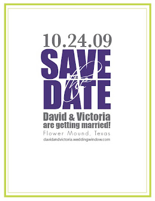
Here is another wonderful Save-the-Date card that I recently completed for a custom wedding client! Right around the first of the new year, I was contacted by a charming bride-to-be in Grand Prairie, Texas about creating first a set of letterpress printed Save-the-Date cards and then a complete set of wedding stationery for her wedding which is coming up in late October of this year. Victoria discovered Twin Ravens Press through Mrs. Coconut on Weddingbee.com. I designed and printed her stationery last year. If you'd like to see photos of her stationery on this blog, you can find them here.
As a designer, it's always really exciting when you get to work with a client who wants something - a paper type, a design, a color scheme, etc. that you've never used or worked with before. I was really excited to work with Victoria from the get go because she had a really unique set of colors that I hadn't ever used in an invitation suite before: chartreuse, violet and charcoal grey and because I knew that designing for her might be a challenge. Why was it going to be a challenge you might ask? Her design looks really modern and straightforward. Well, when we first started talking, I asked Victoria, like I ask many of my clients and perspective clients, what sorts of designs appeal to them. When asked this question, Victoria initially said that she liked modern looking invites, but just really didn't like "designs". Hmm... What I ended up discovering after working with her for a few weeks, wasn't that Victoria didn't like designs, it's just that she didn't like or want any graphic elements. This was kind of exciting for me because, while I do love doing invitations and other printed pieces with pretty images and graphics, I also get really excited about designing and printing invitations and stationery suites that are just text. It's fun, very modern or classic, depending on the typefaces used and it's always a great challenge to see what you can do with beautiful typography.
We worked on several designs and finally came to one that it seemed like Victoria and her fiancee, David, really liked. Below is a screenshot of the digital mock-up of that design.
At about the same time that this design was going to go to print, Victoria informed me that her sister was also a graphic designer and that she was really looking forward to creating the designs for their wedding stationery. I think Victoria was a little worried that I would be upset or something by this, but honestly I found it really exciting. I love working with other designers and it's a lot of fun to see how someone else approaches a design project in ways that you may have not even thought of! This is the design Victoria's sister came up with and the one we ended up printing:
It still incorporated Victoria and David's awesome charcoal grey, violet and chartreuse color scheme, but the design filled the card a little more, and in my opinion, looked slightly more modern than the original design we were going to go with. I like it a lot! It's modern, fun, a little bit funky, and using the phrase "tie the knot" on your cards: really cool. We chose to print the Save-the-Dates on Crane Lettra 100% cotton paper in their Bright White color. Because the design was all big, san-serif text without any borders or super-fine details, it was fairly easy to get a pretty deep impression on the paper. The day that I printed them, we had some really pretty sunlight in my shop, so I just took the photos of them while they were still sitting on the feed board of my press. I love how in the above photo you can actually see little shadows that the raised (unprinted) parts of the letters (like the insides of the A's and O's) cast on the printed parts of the invite. It seems a little nerdy to be so excited about that, but I thought it was pretty cool.
Victoria's Save-the-Dates are an A2 size (4.25" x 5.5") and we chose a coordinating Chartreuse A2 envelope from Waste Not Paper to go with them. All of Waste Not's envelopes have a European pointed flap. We printed her and David's names and return address in two colors: Violet and Charcoal Grey to stay consistent with the design of the Save-the-Date cards. Here is a close up of the return address on the envelope:
Isn't it cool!?! I love how well the colors all go together and how fun, modern and fresh the whole design turned out to be. Victoria has hired Twin Ravens Press to print the rest of her wedding stationery as well, so if you like the way these Save-the-Dates turned out, keep watch on this blog! I'll be posting pictures of the rest of her stationery as soon as we finish it!
Thanks so much Victoria & David and congratulations!


3 comments:
It's very surprising to read a blog post and see your hometown on someone's save the dates! I bet they are getting married at the Chapelle des Fleurs.
This just affirms my opinion that "Flower Mound" looks charming on wedding related materials. And your design makes it look even better!
Um, that is the most kick-ass "Save the Date" card I've ever seen!
Kristin! I love love love them!
This is Amanda BTW. I just got my coasters in. I love them too! You are fabulous!
Post a Comment