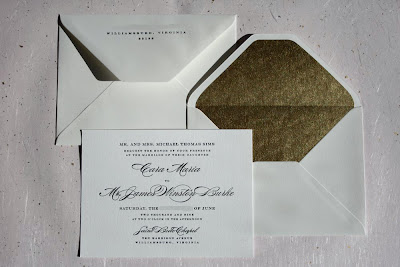
Here is another wedding invitation set I recently completed that reminds me of why I love great, elegant, letterpress printed typography so much! When the bride, Cara, originally contacted me, she was planning on designing her wedding invitations herself and wanted a really clean, crisp, classic and elegant design. Her wedding colors are champagnes, whites, gold and pale pink. Her set included an invitation, reply card with envelope, reception card and an inner and outer invitation envelope. You can see the whole set above! In the following paragraphs I will go through each piece with more detail, show more pictures and talk about why I like these designs and ones like them so much!
Here is a photo of Cara & James' wedding invitation with the two different envelopes.
Cara chose a lovely script font for her and her fiancee's names as well as for the name of the chapel and then used a classic serif font for the rest of text on the invitation. Her invitation is a somewhat unconventional, larger size than a lot of wedding invitations that I do. It measures 6" x 8.125". Generally the standard size for invitations is an A7 which measures 5"x7", so part of what made this invitation suite really unique is its unconventional sizing. All of the pieces in Cara's suite were printed on Crane Lettra 100% cotton paper in their bright white color. We paired the invite with a 100% cotton inner and outer envelope set from Arturo Fine Paper. If you are in the process of designing a wedding invitation suite (or other set of invitations for another event) and want 100% cotton envelopes in unconventional sizes, I would highly recommend Arturo's line of envelopes and stationary. They are beautiful, tactile and take the letterpress printing very very well. I printed Cara's return address on the flap of the outer envelope and then the inner envelopes were unprinted, but we lined them with a fabulous sparkly gold paper (it's really really gold) from Paper Source that Cara found online. Here are a couple of other close-ups of the invitation so you can see the pretty fonts:
Cara did a beautiful job of carrying the whole "look" of the invitation design through the other pieces in her stationery suite. Here is her reception card:
It is still a fairly simple text-only design, but she did a gorgeous job of using the script font from her invitations for the decorative text at the top, while keeping her other information in the same serif font that was used previously. I love the way the script looks for the words "Dinner & Dancing" it's so elegant and classy!
Here is Cara's reply card and envelope. Once again she continued the same open, elegant design with lovely black letterpress typography. She even incorporated both font types (the script and the serif) into her address for the front of the reply card envelope.
Aren't those pretty? The reply card was a standard 4bar size (3.5" x 4.875") and we used Crane Lettra's 4bar envelopes in the bright white color to match the paper. I think this whole suite tied together beautifully and the letterpress printing on it turned out amazing!
Cara has been a fabulous client to work with and I would be more than happy to print any stationery she designs in the future. If you are considering designing your own invitations or stationery and would like more information about our letterpress printing services, please feel free to contact me at twinravenspress@gmail.com!
Congratulations Cara & James and thank you so much for your business!


3 comments:
They look gorgeous, I love them! Thanks again - working with you was so easy and wonderful!
Those are mighty pretty invites!
@Laura: Thank you! I'm glad you like them!
@Cara: I'm so glad you love how they turned out. I think they're beautiful and I would be more than happy to work with you again - you were also fabulous to work with!
Post a Comment