A couple of months ago, I completed this lovely and classic set of wedding invitations for a couple who will be married exactly one month, less a day, from today! When Julia originally contacted me she wanted her wedding invitations to be beautiful and classic and somewhat reflective of their Cape Cod wedding, without being too beachy or modern. I think we totally accomplished that goal with the set of invitations you see above, which featured an A7 Letterpress wedding invitation, inner and outer invitation envelopes, and a reply card with corresponding envelope.
All of the pieces in Julia & John's suite were printed on Crane Lettra 100% cotton paper and came with matching Crane Lettra 100% cotton envelopes in Pearl White. Here is their invitation by itself:
Julia & John's invitation was a classic single-color letterpress invitation using navy blue ink and featured a delicate and beautiful blind-embossed border to frame the text. We also blind-embossed a realistic-looking scallop shell in the center of the invitation to separate the invitation to the ceremony from the reception information. Here are a couple of detail photos so you can see the fonts, inks and blind embossing better:
Isn't it just elegant? I love the way invitations like this one are so simple, and yet so gorgeous style-wise. They really just speak for themselves. I also love that Julia chose to have us blind emboss the border and scallop shell detail rather than using a second ink color. This gave the invitation some lovely texture, that you wouldn't be able to achieve with other printing methods, without making the invitations look too busy. It's just gorgeous!
The outer invitation envelope was printed with the couple's return address, also in navy blue ink using the same script font as the one we used for the couple's names on the invitation.
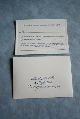
Julia & John's reply cards were a 4bar size, also printed in navy blue ink with blind embossing on Crane Lettra 100% cotton paper. We used the same style of font for the address on the reply card envelopes as we did on the invitation envelopes and tried to incorporate the same design elements from the invitation into the reply card while giving it a distinct and original "look" of it's own.
The reply card itself utilized the same typefaces as the invitation as well as the same blind embossed border pattern. In order to change things up a bit for this piece though, I enlarged the scallop shell motif quite a bit incorporated it into the design in such a way so that it would "bleed" off two of the cards edges. We still used the blind embossing technique for this to create the awesome, textural impression. I then printed the navy blue text of the card directly over the blind embossing, and let me tell you - both the look and the texture are fabulous!
I love the way Julia & John's suite turned out! It's beautiful and classic while being modern and fresh all at the same time! Julia told me that she got many wonderful compliments from her guests and that some even requested to keep the reply card, just because they liked it so much!
Congratulations Julia & John! I know your wedding on the coast is going to be beautiful this September!


No comments:
Post a Comment