Metallic inks have certainly been a popular choice at Twin Ravens Press for the past couple of weeks! I just finished up this invitation suite earlier this month and boy does it make a gorgeous and very elegant use of metallic gold ink and blind embossing! The invitation suite you see above was created for a lovely couple, Rachel and Joseph, who originally contacted me back in June to create invitations for their upcoming January 2010 wedding in Coral Gables, Florida! Rachel and Joseph's suite included an A7 size invitation with corresponding, lined envelope, a 4bar size reply card with corresponding envelope and 4bar folded thank you notes with corresponding envelopes. All pieces were printed in metallic gold ink on Crane Lettra 100% cotton paper in Ecru. The envelopes are Crane Lettra envelopes, printed in gold ink with square flaps.
Rachel & Joseph's wedding invitation created a really fun design challenge for me. When doing design work, it is often difficult to incorporate more than two or three different fonts without the design looking cluttered. If you check out the invitation above we were able to incorporate five (5!) different typefaces as well as some elegant and decorative scrolls and flourishes into the design while still keeping it very formal and pretty. The text of the invitation is centered in a decorative gold border and we blind-embossed the area outside of the border with a series of thin, vertical lines to give the invitation a little more texture. I love how this invitation is for a 2010 wedding, but looks elegant and classic enough to where it could be from a wedding that happened years ago. It's modern and vintage looking all at the same time! Check out this close-up to see some of the fonts and the letterpress impression better:
Above, the invitation and invite envelope are pictured together. We chose a classic, 100% cotton square flap envelope to pair with this invitation. We kept the lining of the envelope very simple - it's a light metallic solid-colored liner in a shade similar to the paper we used for the invites and envelopes. I love how this gives Rachel's envelopes an extra hint of elegance without being too decorative. The metallic in the liner paper gives off just a little bit of shimmer when you hold the envelope open in different light. I love how it adds just a little bit to the overall package without being "too much".
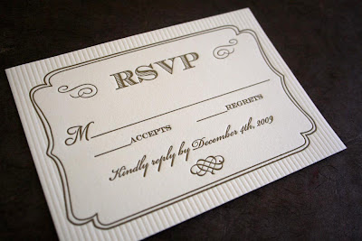
Here are Rachel & Joseph's reply card and reply card envelope:
These are a 4bar size, also printed on Crane Lettra Ecru paper and envelopes with gold ink and blind embossing. We utilized the same decorative gold frame and blind embossing for the reply card and kept the usage of several different, elegant fonts consistent with the invitation in this design.
Very pretty, don't you think?!? I love the little heart flourish we came up with for the bottom of this card and for the bottom of the invite. Rachel and Joseph's replies were going to be received by Rachel's mom in Deltona, Florida, so we letterpress printed her address on the front of the reply card envelopes.
Rachel wanted a really simple set of thank you cards that kept with the elegance of her invitation suite.
For these, we switched things up just a bit and instead of blind embossing the vertical lines like we did on the invitation and reply card, we blind embossed the decorative border instead. We printed Rachel & Joseph's names in gold ink in the center of the blind embossed border in one of our decorative fonts from the invitation. I like how these cards don't have to be specifically used as thank you cards since they don't say "thank you" anywhere on them. Rachel and Joseph could also use them for other correspondence after their wedding if they have extras left over. This card was also paired with a 4bar, Crane Lettra, ecru, square flap envelope. Check out the pair together here:
Rachel was an absolute joy to work with and I know that her wedding in Florida this January is going to be very elegant and beautiful!
Congratulations Rachel & Joseph!


No comments:
Post a Comment