Tuesday, March 31, 2009

Brad & Katie are Getting Married!


I've been pretty excited to show off this suite since I finished it a few weeks ago!  This suite is a fun little "package" that I'm sure the couple's guests are going to love receiving!  The bride-to-be, Katie, contacted me last fall and was looking for an invitation suite that was fun and playful and would reflect their town square wedding in Flagstaff, Arizona this June.  Katie told me that for their wedding, the groomsmen would be wearing linen suits and driving caps and the bridesmaids would be carrying parasols.  Their colors were light pink, light green and chocolate brown and she wanted a design that would go well with their semi-vintage wedding theme while still being fun, playful and unique.  I ended up creating a sweet little package design for them that included a square invitation and invite envelope, a polka dot reply card and a fun little monogram tag with a green ribbon to tie everything together.  You can see all of the pieces in the suite (except the invite envelope) at the top of this post. 

Katie and Brad's suite has a lot of unique and fun little elements to each piece, so I'm going to briefly go through each one.  Let's start with their invitation envelope: 


Katie and Brad chose a square design for their invitations, and because of this, needed a fun and beautiful, square invitation envelope to go with them!  They chose to use a square envelope with a European pointed flap from Waste Not Paper in Khaki for the envelope and I printed their return address in chocolate brown ink on the back flap.  To add a little color and fun to their envelopes, Katie had me line them with a really fun and quirky polka dot paper.  The paper is a light green with an irregular pattern of different sized pink polka dots.  I love this paper as a liner for these envelopes and think it added a lovely and playful splash of color to the suite!  

The main piece inside those beautiful envelopes was their invitation: 


Katie and Brad's invitation is a 5.5" square shape printed in chocolate brown and light pink inks on Crane Lettra 100% cotton paper in Pearl White.  You can see the invite with the envelope and polka dot lining in the photo above.  We chose to use a really fun and playful script font for Katie & Brad's names in light pink and then used a classic serif typeface for the body of the invite text, printed in chocolate brown.  Here is a close-up so you can see the pretty fonts: 


The vintage-looking, chocolate brown designs in the corners were images I made that were inspired by some floral lace.  They are fairly abstract, but still reflect the intricate lacy pattern.  Here is an image of the full invite: 


The tiny lines and dots of the floral-lace patterns give the invite a really pleasurable texture from the letterpress, as well as being really fun for the eye!  

Sticking with the polka dot + vintage theme for the reply card, Katie chose a design with a wide chocolate brown border with white polka dots.  We thought that this piece tied both the polka dots from the envelope liner together nicely with the chocolate brown and pink vintage looking design of the invite.  


The reply card is a standard 4bar size, once again printed on Crane Lettra Pearl White paper in chocolate brown and light pink inks.  It turned out beautifully!  The card was paired with a 4bar Khaki envelope, also from Waste Not Paper, with their address letterpress printed on the front in chocolate brown ink.  


While the designs, patterns, colors and textures of this suite already make it fun and unique in and of themselves, one of my favorite parts of this set is the chocolate brown monogram tag belly bands that we made to tie the whole thing together (literally!).  Katie wanted to somehow incorporate a small monogram into her suite, but didn't necessarily want to use it on the actual invitation.  So, in order to do this, we came up with these small, 2" round, chocolate brown tags printed with their monogram in light pink ink.  


Each tag had two 1/4" round holes punched across from one another through which we thread a 1/4", double-faced, light green, satin ribbon.  I then layered one invitation with a reply card and the monogram tag belly band and tied the ribbon in a small overhand knot behind each invite.  Here is what the package looks like put together: 


The reply card envelope was slipped into the package on the backside, behind the knot, like so: 


And here is what it looked like put together with the envelope:


Pretty cool, don't you think?  I love the way that the monogram tag belly band tied the whole package together while keeping with the fun, playful, vintage theme.  I also love how we managed to incorporate some sort of polka dot element into each piece without making it too overwhelming.  Katie and Brad's suite turned out absolutely gorgeous and I know their wedding this June is going to be just as fun (if not more so) than their stationery!  

Congratulations Katie & Brad!

Monday, March 30, 2009

Thank You Cards, Miami-Style


Happy Monday morning everyone!  I wanted to share with you a really nice little set of thank you cards we completed last week that compliment a wedding set we created and shipped back in January.  The wedding set was for Danielle and Matt who are from New York, but getting married in Miami this Saturday.  If you didn't get to see the original post on their invitations, you may want to check it out here.  They are pretty cool.  

If you remember seeing their suite before (or if you just checked out the above link), you'll remember the cool Miami skyline we used throughout the different pieces.  We chose to continue with that theme for the thank you cards by creating a really nice 4bar card on Crane Lettra 100% cotton pearl white paper with the skyline on the bottom edge.  We then printed the couple's names in the sky area above the buildings in turquoise ink.  All of the cards are folded, blank on the inside for their own thank you message and have a matching turquoise envelope with their return address printed on the back flap in black.  You can see a photo at the top of this post, or below: 


This is just one of several cool new things we've been printing around here lately that I have to show you.  Coming up later this week will be a new letterpress Bar Mitzvah invitation set, two new wedding invitation sets and some fun new cards that will be available in our etsy shop, so check back soon!

Tuesday, March 24, 2009

Theresa & Matt are Getting Married!


Here is another lovely wedding invitation suite I completed last month for a couple in South Carolina!  Matt and Theresa are getting married next month in Greenville, South Carolina and wanted a classic, elegant and beautiful set of stationery for their wedding.  You can see a photo of all of the pieces from their invitation suite at the top of this post!


Above is a photo of their invite.  Matt and Theresa chose a standard A7 size for their invitation and wanted to stick with classic black ink and two beautiful typefaces.  They chose Crane Lettra Pearl White paper for all of the pieces in their suite, because it's beautiful, soft and takes the letterpress impression really well.  Here is a close-up photo of part of the invite so you can see the pretty typefaces they chose: 


Their reply card is a standard 4bar size, printed on the same 100% cotton paper and in the same fonts.  I really love the beautiful swash "T" at the top for the "The" in "The favor of a reply is requested..."  I also really like how Theresa chose to have her guests indicate which event(s) they planned to attend.  If you are having multiple events happen on your wedding day, in many cases it's nice to know which event(s) guests will be attending and who will be at what, especially if, say, the reception doesn't immediately follow the wedding.  Here is a photo of the reply card by itself: 


And another close-up to show off the letterpress impression and the pretty fonts: 


Prior to hiring me, Theresa had seen this suite that we did several months ago for Kiely & Scott that style-wise is fairly similar.  I sent her a sample in the mail of Kiely & Scott's invitation when we first started working together, and Theresa really liked the envelopes that Kiely had chosen for her suite and decided to use the same ones.  Both the reply envelope and the invite envelope are from Green Paper Company.  Green Paper Company is an awesome Chicago-based paper company that produces beautiful, colored papers and stationery items, all of which are made of at least 30% post-consumer recycled waste.  I enjoy working with them because they are both beautiful for letterpress and great for the environment!   Here is a photo of Theresa's reply card with it's corresponding reply envelope from Green Paper Company, printed by us: 


If you read the post about Kiely and Scott's invitations, you'll recall me talking about a pretty shiny paper in blue that is almost like fabric that we used to line Kiely's invite envelopes.  Theresa really liked that paper, but she's incorporating evergreen and chocolate brown into the accent colors of her wedding.  Lucky for her, the same liner paper also comes in an evergreen!  Here is a photo of her invite envelope lined with the evergreen shiny fabric paper liner: 


And here is a close-up of the return address printing I did on the flap.  I really like how Theresa chose to use the script font that she used for her and her fiancee's names on the invitation for the whole address on the invite envelope.  It's so pretty!   


To complete their invitations we also designed and printed a separate reception card with a map of the area on the back.  It is also a 4bar size, like the reply card, printed on Crane Lettra in black ink.  I really love letterpress printed maps, they always look so cool.  Here is a photo of the card, back and front: 


Very pretty, don't you think?  I think they turned out fabulous!  I am currently in the process of producing a gorgeous multi-page, letterpress printed program, a dinner menu, a kissing menu, table signs and thank you cards for this same couple for their upcoming wedding.  I will post some info and photos of those when they are done!  

Theresa and Matt have been an absolute pleasure to work with and I'm really excited they chose to hire me for their wedding!  They are also a really really cute couple.  When we first started working together, Theresa sent me this link to a YouTube video of Matt's marriage proposal.  Theresa is an executive producer at the NBC News station in Greenville and Matt proposed to her at work.  I've watched this video a couple of times now, and it just makes me totally happy every time I do because it's so cute.  Check it out if you'd like:  


Congratulations Theresa & Matt!

Monday, March 23, 2009

Awesome.


Okay, this one isn't letterpress, or wedding, or stationery related in the slightest, so if that's all you've come for, you may want to skip it.  However, I saw this photo this morning on ffffound! and thought I needed to share it with you.  It seems like living in a college town you see tons of "Lost Dog" and "Lost Cat" posters up on telephone posts and bulletin boards every spring (well, and all times of the year), but I thought that this poster, even though it probably wasn't put up in my town, was, in a word: awesome.  

I have lots of awesome new stationery to share with you later this week!  Stay tuned!

Wednesday, March 18, 2009

Save the Date: Allison & Matt are Getting Married!


Around the same time that I completed this wedding suite for Linda & James in New York, I also completed a lovely set of Save-the-Dates for a bride in Boston who is getting married this summer in Hawaii!  The bride-to-be, Allison, came across the design we did for Mrs. Coconut on Weddingbee and really loved the scroll pattern that we used.  She wanted to somehow incorporate our scroll pattern into her Save-the-Dates and eventually her full invitation suite.  She also wanted to incorporate a little bit of Hawaii into the design, since she's having a destination wedding, and we thought that using a pretty pink hibiscus flower would be a great way to do that.  You can see the completed Save-the-Date at the top of this post, with the matching envelope, and you can also see it here:  


Allison's Save-the-Date is an A2 size card (measuring 4.25"x5.5") that was letterpress printed on Crane Lettra 100% cotton paper in their bright white color.  We used one ink color for the whole design (the pink) and then blind embossed the scroll pattern Allison liked on the left-hand side of the card.  Here is a close-up of the blind embossed pattern: 


This was the first time I had ever embossed this pattern rather than printed it and the results were absolutely lovely!  Embossing is a terrific way to add another gorgeous element to a letterpress printed piece, especially if you only plan to use one ink color.  It's beautiful, unique, interesting, and in most cases will save you more money on your printing than using a second ink color will.  

Allison chose to go with a matching white envelope with a European pointed flap from Waste Not Paper with her and her fiancee's return address printed in pink on the back flap.  Here is the envelope by itself:  


The envelope is very simple, yet pretty, and went with their Save-the-Dates perfectly!  Here is another close-up of the invite, just because I liked the photo:  


I am currently in the process of working on the rest of Allison & Matt's invitation suite with them and will post photos of the rest of their stationery later this year!  If you really like this design and would like to see how everything else turns out, please check back at this blog in a couple of months!  

Congratulations Allison & Matt!  

Tuesday, March 17, 2009

Our first Bat Mitzvah


Today I thought I would share with you the first Bat Mitzvah invitation suite I ever designed and printed.  This isn't a newly completed job, but it's less than a year in the past and I thought it was a lovely one!  I'm also showing this one off because it lead us to another client who ordered invitations for her son's Bar Mitzvah which will be held next week - those invitations turned out awesome as well, and I will share them with you soon! 

For those who don't know, a Bar or Bat Mitzvah (Bar for boys and Bat for girls) is a Jewish ceremony celebrating a boy or girl coming of age in the Jewish community.  The Bar or Bat Mitzvah ceremony is typically an ordinary Sabbath service in which the boy or girl participates for the first time as an adult.  Typically a boy becomes a Bar Mitzvah at the age of 13 and girls become Bat Mitzvahs at the age of 12.  Following the service there is often a celebratory meal or other type of party with family, friends and members of the Jewish community.  If you'd like to read more about Bar and Bat Mitzvahs you can here.   

I really enjoy designing paper goods for various types of celebrations.  Currently the majority of custom invitation work that Twin Ravens Press does is for weddings, but I also really enjoy doing invitations for different cultural rituals and ceremonies other than weddings, as well as for occasions like baby showers and birth announcements.  It's a lot of fun and is one of the things that keeps the work that I do interesting.  

So, as you can see from the photo above, the first Bat Mitzvah invitation I ever did was for a girl named Dahlia who had her Bat Mitzvah last September.  Dahlia and her mom came by my studio and we worked on creating an invitation and postcard-style reply card for her then-upcoming celebration.  Dahlia's favorite color is blue and she really wanted a blue dahlia flower on her invites.  We did something really unique for Dahlia's invitations that I think is a great idea for any type of ceremony that will involve a response card.  We printed the invite and the reply card on a single sheet of paper and then perforated it so that the cards could be easily separated from each other when the recipient was ready to mail back their response.  This is a great idea especially if you know you will be mailing out your invitations far in advance of the ceremony and you're worried that your invitees might misplace the reply card.  Having them as one perforated sheet helps keep both parts together until the recipient is ready to send their response back!  You can see Dahlia's invite/reply card together in the photo at the top of this post.  Below is a close-up of just the invitation portion:  


I really love how simple, yet beautiful this design turned out!  The large blue dahlia in the background is fun and whimsical and the font Dahlia & her mom chose for the name and date went with it perfectly!  They chose a coordinating blue envelope to go with the invites and we printed their return address on the back flap, just like we do for most wedding invitation suites.  Here is a photo of the two parts (invitation and reply card) separated along with the envelope: 


Below is a close-up of the response card portion.  The response card was a postcard format so there is a front and back to it.  Here is the front side: 


And here is the back side:  


For the back side of the reply card, we used the same large blue dahlia that we had been using throughout and then simply printed the family's return address in the center with a little box in the upper-right hand corner for the stamp.  

Aren't they pretty?  This coming week I will share with you my first Bar Mitzvah invitation suite which was just completed last month.  

If you would like more information and pricing on our custom bar & bat mitzvah invitations, please e-mail me at twinravenspress@gmail.com!  


Monday, March 16, 2009

From the inbox...


You may remember a post I did back in October, prior to the most recent Presidential Election about some cards that I designed and printed in support of the Obama campaign.  You don't remember that post?  Well then, you can go back and read about it here.  We ended up giving away all of the cards as a result of that posting and today I received a lovely e-mail message from one of the recipients.  She wrote: 

I'm one of the people that you gave an Obama card to back in October and I just wanted to let you know how it ended up. I framed it and gave it to my mom for Christmas.  I was a little nervous about it because it was a good bit smaller in comparison and not made by me as my sisters presents were, but she absolutely loved it.  (She definitely got a little teary eyed.) 
 
Thank you so much!
She even sent us a picture of the framed card we sent her, which you can see at the top of this post.  Pretty cool, don't you think?  It's always great to hear from people who are enjoying your work.  

In case you were wondering, I no longer have any more of the Obama cards from the original printing.  However, because of their popularity, I am considering doing a second printing, which I will post about here, when and if it ends up happening.  It won't be for a little while, due to the number of different custom jobs for weddings, bar and bat mitzvahs and baby showers/announcements that are currently in the works, but I will definitely keep you posted.  

Thanks so much Caitlan, and I'm so glad you and your mom loved the card!

Thursday, March 12, 2009

Linda & James are Getting Married!


Our lovely spring wedding busyness is continuing nicely and I will be showing off several new sets of wedding stationery to you very soon!  This is one of the first of those newly completed sets.  A month or so ago, I was contacted by a lovely bride-to-be in New York City named Linda, who had fallen in love with the custom letterpress wedding invitations that we created last year for Mrs. Coconut on Wedding Bee.  If you want to see the post we did on that set of invitations, with pictures, on this blog, you can find it here.  Linda is getting married in June at the Brooklyn Botanical Garden and thought that a design similar to the one we did for Lynn (Mrs. Coconut) would be just perfect for her!  Linda wanted to use different colors and fonts and change the design up just a little bit, but still keep pretty much the same layout and design elements.  You can see the complete suite we designed and printed for her above!


Here is Linda's invitation by itself.  We used a very nice spring green for the scroll pattern, the birds, and the couple's names and a chocolate brown for the little dots and the rest of the text.  The invitation is a standard A7 size and was printed on Crane Lettra 100% cotton Pearl White paper.  Isn't it pretty?  Below is an even closer close-up so you can see the pretty fonts and colors that we used: 

The invitation was paired with a coordinating green invitation envelopes from Green Paper Company.  We used the same script font that you can see above for their return address that was printed on the flap.  The return address was printed in chocolate brown, which stood out really nicely against the green.  Check it out below: 


Linda also ordered a set of reply cards to compliment her suite.  For the reply card envelopes we used the same green from Green Paper Company and printed the same style of address on the front of a 4bar envelope.  You can see that here: 


Her reply cards are double-sided.  The front side features the reply information along with a space for the guests names and a reply-by date and the back side features a space where the guests can write a message to the couple.  Here is a photo of the front and back side of the reply card with the envelope: 


To save some money on printing and platemaking, we decided to go with one color for the reply card.  We used the same green from the invitation and this is how it looks: 


I really love the way this design turned out in one color and I think Linda's use of two colors for the invite and one for the reply card was an excellent and cost-effective idea!  If you really like a particular design, but want to try to save some money on your printing, mixing up whether you do one or two colors on your different pieces is a great way to do that!  Notice in the above two photos how you can see the letterpress impression from the front side on the back and vice-versa?  Linda asked me to do a really deep impression and this is what you get.  I don't recommend going super-deep on pieces that are double-sided because it can make them hard to read, but for this design I think it worked out well.  

Congratulations Linda & James!  

Wednesday, March 11, 2009

Wedding Sneak Peek


I'm very excited about a rather large wedding invitation order that I've been working on printing this past week.  The wedding colors are deep plum and white and I've already printed the invitations, reply cards, outer invitation envelopes and reply card envelopes.  Those four pieces, as well as the unprinted inner invitation envelopes are on our house paper, Crane Lettra in Pearl White, printed with deep plum colored ink.  This wedding set also includes a reception card, menus and programs.  The reception card, menus and programs are being printed in a cream (almost white) colored ink on a custom made deep plum colored paper.  I just finished the reception cards and boy do they look cool!  Check them out above and below: 


Pretty fancy, unique and awesome, don't you think?  (The photos were taken in the shop, which explains the uneven lighting and the press and other accoutrements in the background).  

The custom paper was made by Porridge Papers in Lincoln, Nebraska.  If you are unfamiliar with Porridge, they are a small batch custom paper-making studio.  All of their paper is made to order and they have some really fun options, like custom colors (just about any color you could want), scented papers, sparkly papers and plantable papers with growable seeds embedded in them. If you have the budget for it, having custom paper made is definitely a wonderful option for your wedding invitations or other special event.  We are also printing the menus and programs for this suite on this same plum colored paper.   Watch out for those and the rest of this suite in a later post!  

Monday, March 9, 2009

Custom Business Cards: Sarah Quest


I have an awesome friend named Sarah who finished massage school last year and is starting her own massage therapy business here in Eugene!  Lucky for me, Sarah (along with being awesome and my friend) is also a fan of letterpress printing.  Not too long ago she and I got together and designed and printed her first set of business cards, which you can see above and below:


Sarah's cards are printed on Crane Lettra 100% cotton paper in Ecru in Chocolate Brown and Metallic Copper inks.  It may be a little difficult to see from the photos, but the majority of the printing on the card is brown with her name and the little flourish above the majority of the information printed in copper.  I think the little touches of copper were a very nice and slightly subtle accent to the card, which otherwise would have probably been only one color.  

As a massage therapist, Sarah offers Swedish, Thai, and Ashiatsu Massage, as well as Hot Stone Massage and Aromatherapy treatments.  She is currently working on building up her client base, so she is offering a new client special, referral specials and student discounts.  

I couldn't possibly say enough on this blog about how awesome Sarah is as a massage therapist (and friend).  I go to her personally for all of the bodywork I've had and she is fabulous!  If you live in the Eugene/Springfield area and would like to get a massage, you should contact her by phone or e-mail (listed above on her business card - see photo) or online through her website.  Clicking on the link will take you directly to her site where you can view more information about Sarah, her pricing, and services, as well as book an appointment online.  How cool is that?!?  

Thanks so much Sarah, you are awesome! 

Letterpress Calling Cards: Anton Fraga


I recently printed this set of calling cards for a friend-of-a-friend who is going to be finishing his graduate program at the University of Oregon very soon and wants to start looking for jobs in the area.  Anton studied Spanish and wants to find work where he can use his dual-language skills in a professional business setting.  

For the card designs, Anton really liked the design that I did last October for Chuck Herro's calling cards.  You can find photos of those here.  Anton wanted a clean, simple, but also professional looking design that wasn't too occupation-specific, since he's not quite sure what exactly he'll be doing yet.  We thought that this design with two clean, crisp, classic fonts would be just perfect!  The cards are printed on Crane Lettra 100% cotton paper in Bright White in black ink!  


Very professional, if you ask me! 

Thursday, March 5, 2009

Beautiful Thank You Notes for a Beautiful Wedding


One of my favorite custom clients, Nataliya, recently had me print these gorgeous thank you notes that she designed.  I first starting working with Nataliya this past fall when she hired me to print her wedding invitations for her November 2008 wedding.  Nataliya creates really beautiful and unique designs.  We enjoyed working together so much, that after I printed her wedding invitations she hired me to print a very awesome set of calling cards for her and her husbands' best man, Sebastian.  If you'd like to see pictures of both the calling cards and Nataliya's wedding invitations you can in the blog post I did here.  

For Nataliya's thank you cards, she wanted something that could be a little more general purpose, so she could use them for other notes and letters rather than for just her wedding thank you notes.  She said that while she loved the way her wedding invitations turned out she wanted to go in a new direction with these cards and I think that what she came up with is beautiful, unique and stunning.  The cards are simple: they are an A7 (5"x7") standard flat card, printed on Crane Lettra Pearl White Paper with matching white Crane Lettra envelopes.  She created a gorgeous leaf motif that we printed in the bottom right corner in dark grey ink along with her and her husband's names.  For the names Nataliya created a mirror effect and we printed part of the names in the dark grey ink and the other part in metallic silver.  Check it out!  


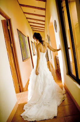
Nataliya was also sweet enough to share some of the photos of her beautiful Costa Rican wedding with me from last November.  She also gave me permission to share them with you.  I thought this was really fun, because often I never get to see photos from people's actual ceremonies since I'm working with them at the very beginning of their wedding planning process.  Nataliya's wedding looks so gorgeous and it seems like they had a wonderful time!  Check those out below: 


Doesn't the whole thing look lovely?  Not to mention that the bride looks absolutely stunning as well.  You'd think that the photos came straight from a magazine.  

Thanks so much again Nataliya!