Monday, August 17, 2009

Etsy Treasury Feature: String of Crane Cards


I checked my inbox this morning to find that one of my greeting card designs is being featured in an Etsy Treasury today for The Killian Mansfield Foundation. My letterpress printed "String of Cranes" card is the left most item in the third row.  Click on the link if you want to check it out for yourself.  

Killian is a 16-year-old boy in upstate New York who is suffering from a rare form of cancer. Killian's favorite story is the Japanese tale of Sadako and her 1,000 paper cranes. If you haven't ever heard of the story, you should read more about it here. Killian is also apparently a very talented Ukulele player and you can purchase a CD of his music from the treasury by clicking on the link at the top. All of the proceeds from sales of the CD benefit his foundation.  Go check it out!

Friday, August 14, 2009

Nikki McClure


Image copyright Nikki McClure, via www.nikkimcclure.com

Happy Friday everyone!  I just found this interview online of one of my favorite artists, Nikki McClure.  Nikki lives and works in Olympia, Washington and is best know for her painstakingly intricate paper-cuts.  Nikki uses an exacto knife and a single sheet of paper to cut out complex images that speak to ideas of motherhood, nature and activism.  I know she's also done some mixed media work with letterpress as well.  The video interview below totally speaks to many of the reasons why I enjoy being an artist myself and to why I love living in the Pacific Northwest.  Anyway, if you aren't already familiar with her work, you ought to check out the video below, as well as her website.  Have a fantastic weekend!


Thursday, August 13, 2009

Katie & Matt are Married!


Photo Courtesy of Bishop Photography

Earlier this year I letterpress printed a really sweet set of wedding stationery for a really sweet bride-to-be in Baltimore named Katie. Katie works for Baltimore Magazine and contacted me about printing a really fun set of wedding invitations that she had designed herself for her then-upcoming June 27, 2009 wedding. Katie recently got back in touch with me about potentially printing some wedding stationery for one of her friends and at the same time sent me some totally fun photos from her wedding in June. Since I hadn't had a chance to blog about Katie's wonderful paper goods, I thought this would be a fabulous opportunity to not only show off her stationery, but also show off a few photos from her wedding.

The photo at the top of this post as well as the next two are photos Katie sent me from her wedding. I love the shot on the steps of them with their wedding party in the background and I LOVE the shot on the park bench where you can see Katie's orange heels.


Photos Courtesy of Bishop Photography

Don't Katie and Matt just seem like one of the cutest couples you've ever seen? Anyway, on to the stationery!


Like I mentioned previously, Katie designed the invitations for her wedding herself and hired Twin Ravens Press to print them. Katie and Matt's suite included the invitation and corresponding envelope, a reply card with corresponding envelope, a reception card and a lovely hand-drawn map card. You can see an image of the whole suite above. Katie's colors were navy blue, orange and chartreuse and I absolutely love the way she managed to incorporate all three into the suite! Here is an image of Katie & Matt's invite and invite envelope separately:


All of the pieces in Katie and Matt's suite were letterpress printed on Crane Lettra 100% cotton paper in their Pearl White color. The invitation envelope was also Crane Lettra Pearl White and featured a pointed flap with their return address printed in navy blue ink. I love what Katie came up with for her invitation! Rather than spending extra money on printing multiple ink colors for her pieces, Katie used a different color from her wedding palette for each piece. In order to make the invitation stand out a little more from the others, she had us matt the invitations onto navy blue card stock, leaving a 1/4" border, and then she secured an orange ribbon around the middle of the invite, with the ends being hidden by the card stock matt. I love the way the ribbon creates a natural visual separation between the actual invitation portion of the text and the text that explains where the event was taking place. I also love how the ribbon added an extra "splash" of color and texture to the piece without adding additional costs to their printing. Here is a closer look at the invite and a detail of the printing with their names and the ribbon:


Another thing I absolutely love about Katie and Matt's invitation is the fun mix of script and roman fonts that Katie chose to use in the design. She also created a simple and playful, but elegant, monogram of her and Matt's initials that was featured at the top of the design. Below is a detail of it. The letterpress impression turned out fabulous!


Since Katie and Matt's wedding was held in a church and their reception was being held in a different location (The Baltimore Museum of Art), Katie designed a separate reception card to include in the suite. The reception card was also printed on Crane Lettra and this time we used orange ink to coordinate with the ribbon from her invites.


Katie's reply card was also printed in another ink color. In order to incorporate all three of her wedding colors, it was printed in chartreuse! Again Katie did an excellent job coordinating all of the pieces by keeping the "look", fonts and layouts fairly consistent while switching up the colors on the different pieces. Here is the reply card by itself:


Katie's reply card (as well as her reception and map card) was a 4bar size and came with a coordinating 4bar envelope from Waste Not Paper Company. The reply envelope was a light blue color with a European pointed flap and we letterpress printed the address on the front of it in navy blue ink. Here are the reply card and reply card envelope together:


The last (but certainly not least!) piece in Katie and Matt's suite was their map card. Over the last few years I've seen and done map cards several different ways. Some map cards for weddings have a map and directions, some just have written directions with no map and others just have the visual map. Katie's map card didn't feature any written directions, however, the drawing was so self-explanatory and, needless to say, absolutely adorable, that I don't think anyone could have gotten lost. Katie drew the map herself and I letterpress printed it in navy ink.


Isn't it sweet?!? Katie and Matt were one of the sweetest and from the looks of it, cutest, couples I got to work with this spring. I'm very excited to potentially be working with Katie again on some stationery for one of her friend's upcoming weddings. I'm also very excited that she let me share some of her wedding photos and photos of her stationery with you! Everything turned out fabulously and I wish them all the best!

Congratulations Katie & Matt!

Monday, August 10, 2009

Letterpress Printed Watercolor Maps


Remember the awesome letterpress printed invitation booklets I blogged about last week that were created for Allison & Ryan?  Well, there was one other part of that project that I didn't mention yet: water-colored letterpress printed maps.  When Allison and Ryan hired me to do their invitation books, they also had me print a few extra copies of their maps to send back to the original designer/mapmaker, Crystal Kluge, to be water-colored.  I was just over checking out Crystal's blog this morning and saw some images she posted of the finished maps and boy do they look fantastic!  You can see a photo of one of them at the top of this post, and you can find the pics of the others here.  Aren't those great?!?  And what a fantastic and beautiful keepsake to hang up on your wall.  Love 'em!

Sunday, August 9, 2009

A Successful Fair!


The 2nd Annual Letterpress Printer's Fair in Portland yesterday was a huge success, with over 500 Portlanders and Letterpress enthusiasts visiting throughout the day to check out over two dozen vendor's letterpress printed cards, broadsides, posters, books, equipment and other letterpress ephemera that was for sale at Liberty Hall.  Twin Ravens Press was selling mostly letterpress printed greeting cards and coasters, most of which can be found online in our etsy store if you missed the show, as well as some random equipment odds and ends.  

I owe a big thank you to Carye Bye of Red Bat Press and Ivan Snyder of the AAPA for organizing the show.  I also owe a big thanks to my very good friend and fellow Eugene printer, Bob Giles, for all of his help manning our table yesterday.  It was a lot of fun and I look forward to helping out with and attending next year's show!  If you weren't local to Portland and/or couldn't make it out to the show, check out some additional photos at Red Bat Press' flickr stream here.  We also got a very lovely write-up on Art Scatter, which you can read here.  

Have a Happy Sunday and I'll be seeing you next week!

Wednesday, August 5, 2009

2nd Annual Letterpress Printer's Fair in Portland, Oregon


If you're going to be in Portland, Oregon this Saturday, August 8th, you really ought to come down to Liberty Hall at 311 N. Ivy and check out the Second Annual Letterpress Printer's Fair.  Several presses will be in attendance at the fair from 11 am to 4 pm, including Twin Ravens Press, Red Bat Press, Em Space Book Arts Center, Garage No. 3, The Independent Publishing Resource Center and several others.  I will be selling letterpress greeting cards, coasters and some fun letterpress odds-n-ends.  I will also have for sale a NuArc Photopolymer/Offset Plate Burner.  The show was both successful and fun last year and I imagine it's going to be even grander this second time around.  Come down and check it out!  

Tuesday, August 4, 2009

Allison & Ryan are Getting Married!


I've had the pleasure the last few months of working on a rather complex, but totally beautiful wedding invitation suite for a lovely couple who are getting married near the Oregon Coast later this year!  Allison and Ryan's invitation suite (or rather, booklet) is one of the most unique projects I've printed lately, partially due to it's complexity, partially due to getting to work with some other very talented artists/designers and partially because of the bride, Allison's, totally awesome, eco-conscious style!  

From the very beginning of our design discussions, Allison knew she wanted something for her invitation suite that was beautiful, but also highly eco-conscious and sustainable as well.  We accomplished this in several different ways.  First of all, Allison's book design was created using natural and sustainable papers from a couple of my favorite sources, and secondly, the book design allowed us to put all of the information Allison wanted in her suite into one gorgeous little package, eliminating the need for extra cards the would have used more paper and might be tossed after the ceremony.  

You can see a picture of what the booklet looks like open to the main invitation page at the top of this post.  Here is what the booklet looks like closed: 


Allison's booklet's measure 5"x5" square and the covers were made from beautiful dark brown, Nepalese Lokta paper.  Allison has a French-inspired lavender and poppies as well as an outdoors/summer camp theme for her stationery and wedding.  In order to dress up the outside of the books a little I glued a stem or two of fresh pressed lavender to each cover flap.  This gave all of the books a much more unique and natural feel, as well as causing them all to smell absolutely lovely (like lavender!).  

If you were to receive one of these invitations, open the front cover, and this is what you would see: 


Allison's books were comprised of six pages on the inside, all made out of a custom 100% cotton recycled paper that is embedded with wildflower seeds from Porridge Papers.  I've worked with a variety of Porridge's creations on several different occasions and their paper is so wonderful, beautiful and unique!  It takes letterpress impressions beautifully and the most awesome part is that it's truly plantable - if the seeded paper is planted it will actually grow wildflowers!  How cool is that?!?  

Here is a close-up of Allison & Ryan's first page: 


Allison and Ryan's book opens with a very sweet little poem letterpress printed in chocolate brown ink.  All of the hand-lettering that you will see throughout these books was done by the very talented, Crystal Kluge of Minneapolis.  Allison and Ryan hired Crystal to do much of the lettering for their invitations as well as to design some gorgeous maps which you will see later in this post.  Seriously, if you haven't checked out Crystal's work, or blog you really ought to. Her talent truly runneth over...  Plus, she's incredibly awesome to work with.  If you'd like to see her posts about this suite, you can find them here or here. 

Turn the page and you will find Allison and Ryan's main invitation.  The invitation is simply another page of the book, however, to make it stand out a little more from the rest we printed it in three colors (chocolate brown, violet, and deep red) and we did some blind embossing as well, as part of the design.  You can see a view of the whole book, opened to this page at the top of the post, and you can see a close up of it here: 


The invitation and graphics for it were designed by Twin Ravens Press, and the hand-lettering was done by Crystal.  I didn't know it until we were well into the design process, but Crystal also designed the font that we used for the body text of the invitation.  It's called Silverstein.  If you like it, you can purchase it from Font Bros. here.  

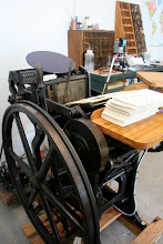
Because Allison and Ryan are currently working out of the country (and just because they were curious), I took several photos of the invitations throughout the printing process to e-mail them.  We figured, this way, they could have a virtual experience of seeing the process of how their invitations were created.  Here is an image of one of my presses, an 8x12 Chandler and Price platen.  This is the press that was used to create Allison & Ryan's (as well as most of my other client's) wedding invitations.


And here is what one of her invitation pages looked like as it was coming off the press: 


Pretty neat, huh?  As always, if you are a client local to Eugene or Oregon, and if you'd like to come by and see your invitations as they are being printed you are more than welcome to!  Just let me know.  Likewise, if you are an out-of-town, out-of-state and/or international client and would like us to take pictures of the process of printing your invitations, I'd be more than happy to oblige.  Just ask!

After the gorgeous invitation, are three separate pages each with a different hand-drawn map of different areas relating to Allison and Ryan's upcoming ceremony.  The maps feature Portland, Oregon, a larger view of Western Oregon and their ceremony site.  All maps were hand-drawn/designed by Crystal Kluge.  I love how whimsical they are!  Crystal sent me the drawings and then I created a printing plate of each of them and printed them on the separate pages of Allison's books using chocolate brown ink.  Check them out: 


Aren't they gorgeous?!?  Last but not least, the final page of the book explains how to send your reply for this gorgeous event.  For logistical reasons, as well as to save paper, Allison and Ryan opted to have their replies made via a website.  This is a great idea if you are moving, out of the country, and/or just want to save some paper and postage right before your wedding.  


Each book was hand-bound by me using chocolate brown linen thread.  If you flip the books over, to the back cover you will find a tiny surprise!


Very subtly letterpress printed in black ink you will find a tiny (about 1" square) Viking-Ninja.  Allison told me a wonderful story, which I'm sure she may elaborate on more in detail later on her blog (she's a blogger over on weddingbee.com).  However, the Viking-Ninja was at Ryan's request - he one day wants to write a very cute sounding children's story involving one and they wanted to have him featured as a subtle and quirky little extra on their invitation.  The viking ninja was drawn by one of my very good friends, and also the proprietor of Spastic Rabbit Studio on etsy, Tara M.  I just love it when couples include an element or elements that are truly and uniquely "them" as part of their invitations.  It makes the whole thing so much more personal and fun!

The other piece we printed in conjunction with Allison and Ryan's lovely books was a 5.5" square envelope to go with them!  These envelopes are from Waste Not Paper company and are their Luxe Cream color.  Allison and Ryan's return address, as well as one stalk of lavender, was letterpress printed in violet ink on the back flaps.  You can see the envelope and booklet together in these images:


Aren't they gorgeous!?!   Allison and Ryan were absolutely wonderful clients to work with and I know that their quasi-French, eco-friendly, summer camp wedding on the Oregon Coast in September is going to be totally awesome and beautiful.  Once again, if you'd like to read more about Allison's wedding in her own words, go check out her blog, she is Miss Bearcub on Wedding Bee.  

Congratulations and thanks again, Allison and Ryan!