Friday, October 30, 2009

The Wedding Invitations of Mr. & Miss Ramen


Let me preface this post by saying that no, I didn't print wedding invitations for a couple whose last name is actually "Ramen". As this particular couple asked me not to reveal their real names on my blog, I will be referring to them by a pseudonym they chose for themselves. You see, Miss Ramen is a blogger over on WeddingBee, and the fifth WeddingBee blogger that we've printed invitations for. If you are a follower of WeddingBee, you may have already read some blog posts she's done about her wedding there. If you aren't, but like what you're about to see of her invitations, you can read more about her wedding here. Despite having to be a little sneaky about the information I show off to you about their wedding on this blog, working with the Ramens was an absolute joy and their invitations are absolutely lovely.

The Ramens, being the talented and uber-motivated individuals that they are, designed their whole invitation suite themselves and then hired Twin Ravens Press to do their letterpress printing! I heard from Miss Ramen that she is doing her calligraphy for her envelopes all by herself, which, for a bride who isn't planning a small wedding, this is quite the undertaking. The Ramen's invitation suite included a #10 size invitation, a reply postcard, a small business card size website card, an invitation envelope and a set of small cute tags! Here is their invitation:


As I mentioned above, Mr. and Miss' Ramen's wedding invitation is a long and skinny #10 size, printed on Crane Lettra pearl white paper with metallic silver ink. I love the elegant swirls and scrolls they created for all of the pieces in their suite! It's a little difficult to tell, due to me blurring out most of their names, but the typeface they used for their names and for the line at the bottom of the invite really compliments their decorative swirls beautifully!


Here is their invitation again with its corresponding envelope. The envelope Mr. and Miss Ramen chose is a #10 size, 30% post-consumer recycled envelope in a light blue color called "Cloud" from Green Paper Company. I love how these envelopes add just a subtle hint of color to the suite without being bold and overwhelming. I also love how they continued their swirl motif from the invitation on the front of the invitation envelope. The envelopes were also printed with metallic silver ink and included a very cute, framed return address on the envelope flap.


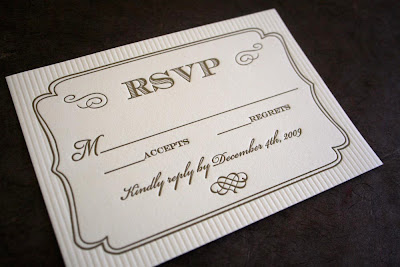
To save on postage and envelopes, Mr. and Miss Ramen decided to do their reply card as a postcard! These were also printed in silver ink on Crane Lettra Pearl White paper.


They did a fantastic job of keeping the look of their entire suite consistent, while incorporating some unique, fun, and super-cute details into each piece. Check out the little whole and broken heart icons next to their accepts/regrets lines:


Very cute idea, don't you think?!?

Now, I'm not quite sure what Miss Ramen has in store for these little guys, but whatever it is, I'm sure it will be adorable. The Ramens had me print them a set of small letterpress tags featuring their initials, wedding date and the city where they will be wed, inside the same cute kind of frame they used for their return address on their envelopes.


Miss Ramen opted to cut these out herself, in order to save money on die-cutting. Although I'm not sure what she's planning to use them for, they are super-adorable.

This last piece in their suite, is quite possibly my favorite. As Miss Ramen is an avid blogger (hence why she blogs for WeddingBee), she wanted to include a small website card that would direct wedding invitation recipients to their website for further information. This card measures 2"x3.5", which is the same size as a standard business card, and was also printed on Crane Lettra paper in silver ink.


Isn't that absolutely adorable?!? I love the cute little caricatures that Mr. Ramen drew of himself and his bride. So sweet... and such a cute idea for a little website card!

Mr. and Miss Ramen were an absolute joy to work with and I'm so happy that I got to do their letterpress printing! If you like these designs, head on over to WeddingBee and read more about the Ramens. They really are a very sweet couple. Miss Ramen posted a very cute teaser a couple of weeks ago, which you can read here, and she just posted at length about her invites here.

Thanks so much Mr. and Miss Ramen and many congratulations!

Wednesday, October 28, 2009

Joanne & Justin are Getting Married!


Continuing my metallic ink theme from yesterday, I present to you these lovely wedding invitations I completed a couple of weeks ago for North Carolina couple who are getting married in Florida this upcoming December! The bride, Joanne, designed her invitations herself (aren't the decorative motifs at the top and bottom gorgeous?!?) and hired Twin Ravens Press to print them. We printed Joanne and Justin's wedding invitation in two ink colors: burgundy and metallic gold on Crane Lettra Pearl White paper. I love the color combination she chose and I think it's going to be lovely for a late-december celebration!


Joanne is planning to assemble her invites herself and had her other inserts (a reply card and reception card) printed digitally to offset some of the cost of her total invitation package. This is really a wonderful option if your invitation budget is tight, but you want to still incorporate a gorgeous letterpress printed piece or two into your suite. Joanne is planning to assemble all of her invites and inserts into a decorative burgundy pocket folder with a belly band! I'm sure the whole package is going to look gorgeous together!

Congratulations Joanne & Justin!

Tuesday, October 27, 2009

Rachel & Joseph are Getting Married!


Metallic inks have certainly been a popular choice at Twin Ravens Press for the past couple of weeks! I just finished up this invitation suite earlier this month and boy does it make a gorgeous and very elegant use of metallic gold ink and blind embossing! The invitation suite you see above was created for a lovely couple, Rachel and Joseph, who originally contacted me back in June to create invitations for their upcoming January 2010 wedding in Coral Gables, Florida! Rachel and Joseph's suite included an A7 size invitation with corresponding, lined envelope, a 4bar size reply card with corresponding envelope and 4bar folded thank you notes with corresponding envelopes. All pieces were printed in metallic gold ink on Crane Lettra 100% cotton paper in Ecru. The envelopes are Crane Lettra envelopes, printed in gold ink with square flaps.


Rachel & Joseph's wedding invitation created a really fun design challenge for me. When doing design work, it is often difficult to incorporate more than two or three different fonts without the design looking cluttered. If you check out the invitation above we were able to incorporate five (5!) different typefaces as well as some elegant and decorative scrolls and flourishes into the design while still keeping it very formal and pretty. The text of the invitation is centered in a decorative gold border and we blind-embossed the area outside of the border with a series of thin, vertical lines to give the invitation a little more texture. I love how this invitation is for a 2010 wedding, but looks elegant and classic enough to where it could be from a wedding that happened years ago. It's modern and vintage looking all at the same time! Check out this close-up to see some of the fonts and the letterpress impression better:


Above, the invitation and invite envelope are pictured together. We chose a classic, 100% cotton square flap envelope to pair with this invitation. We kept the lining of the envelope very simple - it's a light metallic solid-colored liner in a shade similar to the paper we used for the invites and envelopes. I love how this gives Rachel's envelopes an extra hint of elegance without being too decorative. The metallic in the liner paper gives off just a little bit of shimmer when you hold the envelope open in different light. I love how it adds just a little bit to the overall package without being "too much".

Here are Rachel & Joseph's reply card and reply card envelope:


These are a 4bar size, also printed on Crane Lettra Ecru paper and envelopes with gold ink and blind embossing. We utilized the same decorative gold frame and blind embossing for the reply card and kept the usage of several different, elegant fonts consistent with the invitation in this design.


Very pretty, don't you think?!? I love the little heart flourish we came up with for the bottom of this card and for the bottom of the invite. Rachel and Joseph's replies were going to be received by Rachel's mom in Deltona, Florida, so we letterpress printed her address on the front of the reply card envelopes.


Rachel wanted a really simple set of thank you cards that kept with the elegance of her invitation suite.


For these, we switched things up just a bit and instead of blind embossing the vertical lines like we did on the invitation and reply card, we blind embossed the decorative border instead. We printed Rachel & Joseph's names in gold ink in the center of the blind embossed border in one of our decorative fonts from the invitation. I like how these cards don't have to be specifically used as thank you cards since they don't say "thank you" anywhere on them. Rachel and Joseph could also use them for other correspondence after their wedding if they have extras left over. This card was also paired with a 4bar, Crane Lettra, ecru, square flap envelope. Check out the pair together here:


Rachel was an absolute joy to work with and I know that her wedding in Florida this January is going to be very elegant and beautiful!

Congratulations Rachel & Joseph!

Tuesday, October 20, 2009

Elyssa & Justin are Getting Married!


Back in early June I created a really fun and elegant little set of Save-the-Date cards for a Seattle couple who are getting married in Florida this upcoming January. If you missed out on seeing that post back in August, click on the link above and go check them out!

When I began working with Elyssa on designs for her invitations, she wanted to keep with the same colors we had used on the save-the-dates, but adapt the design to be a little more unique and different. Her suite included a set of A7 size invitations and 4bar size reply cards with corresponding envelopes. Check out the whole suite together at the top of this post!


Elyssa's invitation and reply card were printed on Crane Lettra 100% cotton Pearl White Paper. We utilized the same decorative scroll pattern in the design for her invitation as we used in her Save-the-Dates, but rather than having it adorn one side of the invite, used it just on a couple of the corners for a fresh, new look. The Save-the-Dates were printed in a single ink color (violet), but to dress up the invitation a little more, we added a second ink color: metallic silver. I love these colors together and think they are a beautiful choice for a winter wedding! Like the Save-the-Date cards, we paired Elyssa's invitation with a purple envelope that had their return address printed on the flap in silver ink. Check out this close-up of the invitation to see the pretty fonts:


Elyssa's reply card is a 4bar size card printed in violet ink. It features the scroll pattern running down the left side of the card and a couple of lovely scallop shells next to the accepts/regrets options. I love how we were able to include a tiny touch of ocean/beach theme in this suite for Elyssa's Florida wedding, without making the suite look all-out-tropical. Another thing I love about this card is that the "Please respond by December 8th" line is in French. What a fun little, classy detail, don't you think?!?


To add just one more splash of a different color to the suite, we chose to pair Elyssa and Justin's reply card with a metallic gold envelope, printed with violet ink from Waste Not Paper Company. Check it out:


I love how by adding a different colored envelope to the suite, we are able to add an additional color without adding to the total price by adding extra inks. If you're thinking you want to add an additional splash of color to your invitations, without adding to the price of the letterpress printing, using colored envelopes, colored invitation matting, colorful ribbons or other small colorful details, can make a large impact on your design without putting a large dent in your budget.

I'm currently working on a really fun (and decidedly unique) set of Thank You cards for Elyssa's wedding, which I will share with you here when they're done. Check back often if you'd like to see those!

Thanks so much Elyssa and Justin and congratulations!

Monday, October 19, 2009

Anna & Zane are Married!


One of my favorite designs that was created by another designer and printed by Twin Ravens Press this summer was for a wonderful Eugene couple, Anna and Zane. Anna and Zane were married on August 2nd in an outdoor ceremony at a Lavender Farm in Yamhill, Oregon, just outside of Portland. Their letterpress printed wedding invitation suite included a monarch size invitation with corresponding envelope, a 4bar size reply card and corresponding envelope and monarch size programs. You can see the four pieces of their invitation suite (excluding the programs) at the top of this post.


Their gorgeous invitation was designed by Anna's good friend and bridesmaid, Liz Grant. Liz works as a professional designer in Sacramento, California so if you're looking to have some design work done, give her a shout out! The invitation she designed for Anna and Zane was a horizontal monarch size, which is slightly shorter than a standard #10 card, measuring 3.75"x7.25". I love the way that this size for an invitation almost looks like a ticket to the wedding or celebration rather than a classic invite! This design featured a somewhat photo-realistic depiction of the Cascades printed in light blue ink with an evergreen tree and the typography of the invitation printed over the top of it in silver ink. Isn't the design so pretty and wonderfully unique?!? Here is a close-up so you can check out some of the detail in the mountain design, the ink colors, the tree and the wonderful letterpress impression:


We paired the invitation with a "Cloud" colored monarch size envelope from Green Paper Company and printed their return address on the flap of the envelope in silver ink. Here is the invite and envelope together:


The reply card for this suite was fairly simple. It was also printed in silver ink and utilized the same typeface that Liz had chosen for the invitation. To mix things up a bit we paired it with a grey envelope from Waste Not Paper Company.


I love how this card was kept nice and simple, while still keeping with the design of the invitation.

Not too long after they had sent out their invitations, Anna and Zane also hired me to print their wedding programs. Their programs were also designed by Liz Grant and were a vertical monarch size. For the invitations we used the standard 110 lb. weight of Crane Lettra 100% cotton paper in Pearl White. For their programs, Anna and Zane wanted the same paper, but a little bit heavier stock, so we chose the Pearl White Crane Lettra in 220 lb. for them. Since the celebration was taking place at a lavender farm, Liz incorporated some lovely, stylized lavender images into the program design.


These programs were printed on a single, monarch size sheet, double-sided. Their wedding party information was featured on one side in silver ink and their ceremony information was printed in silver ink on the other.


I love the really light shade of lavender ink that we used! I think it paired with the silver that was used throughout all of the pieces in the suite so well! Here is a close-up so you can get a better look:


Very pretty, don't you think?!? I love the way that this suite turned out and I imagine that Anna and Zane's celebration a month and a half ago was wonderful!

Congratulations Anna & Zane! Thanks again!

Tuesday, October 13, 2009

Shorewood Lodge Napkins


Check out these really cool letterpress printed napkins I printed recently for a lovely lady named Phyllis, in Salem, Oregon! Phyllis contacted me after seeing this post I did earlier this summer about some similar napkins I had printed for a couple with a sailboat. Phyllis's son and daughter-in-law recently built a lodge in Minnesota, and Phyllis thought that letterpress printed napkins for their lodge would make the perfect gift! I used photos she gave me of the lodge to make the drawing and then we printed the image as well as their names and the lodge names on the diagonal of the napkins. I think they turned out fabulous!


Letterpress printed cocktail napkins are also wonderful for parties, weddings and other formal celebrations and events. They come in a variety of colors and we can print just about any ink color you can imagine on them, including metallic inks! If you'd like more information about our napkins, feel free to contact me at twinravenspress@gmail.com!

Friday, October 9, 2009

Allison & Matt are Married!


As this summer was such a whirlwind in general for Twin Ravens Press, I've really been enjoying going back over the photos and samples of wedding invitations that we did all summer and getting to show off the ones that got missed on this blog earlier this year. The wedding set you are about to see in this post was designed and printed for a wonderful couple who were married in Honolulu, Hawaii on August 8th of this year. Allison found me through a post on Wedding Bee by a blogger, Mrs. Coconut, that we had done invitations for the November before. I was then contacted by Allison and Matt's fabulous wedding planner, Alia Kennedy of Parasol Events. Alia was really great to work with and I would highly recommend her if you're looking for a wedding planner in Hawaii. I worked with her with another set of clients shortly after working with Allison and Matt (whose stationery I'll show off soon), and she's totally great! Check out Parasol Events' blog here, if you'd like to see more!

Anyway, back to Allison and Matt! They were really a fabulous couple to work with and I love the photos from their wedding that Alia sent me last week! That's them at the top of this post, and there are more photos from their wedding further along in the post. You may recall hearing about them here before if you've followed this blog for a while. I did a post in March about their Save the Date Cards that we designed and printed, which you can find here. Allison loved the blind-embossed scroll pattern and pink hibiscus motif that we used for her Save the Date cards and wanted to continue the theme throughout the rest of her invitation suite.


Allison and Matt's invitation suite included a 6.25" square invitation, a 4bar size reply postcard, an A2 size directions card and a lined 6.5" square invitation envelope. All pieces were printed on Crane Lettra 100% cotton paper in Bright White with 2 ink colors: black and hibiscus pink and all the pieces included blind embossing details.

Here is Allison & Matt's invitation and envelope.


We kept the layout for this piece fairly consistent with their Save-the-Date card design. A wide blind-embossed scroll pattern adorns the whole left side of the invitation and their pink hibiscus detail is featured prominently on the top left. We used black ink for the main body of their text and the same pink for their names. The return address on the envelope was also printed in hibiscus pink. Their envelopes are a European Pointed Flap style from Waste Not Paper Company.


Each envelope was hand-lined with a very light magnolia pink envelope liner created from paper made by Green Paper Company. I think the touch of light pink on the inside of the envelope added just a little extra touch of sweetness and elegance to an otherwise very traditional envelope. Here are a couple of detail photos of the invitation so you can see the blind embossing, impression, colors and fonts a little better:


I love the design of their reply postcard! It is a 4bar size and really keeps with the design of the invitation and save-the-dates. To switch things up a little on this we used the blind-embossed scroll pattern and hibiscus on the bottom edge instead of on the side.


I also love the tiny hibiscus detail next to the line about saving seats in the shuttle. That was Allison's idea and I thought it was too cute!

For their directions card I created a map of a portion of Honolulu and their venue, Lanikuhonua, from some sample maps of the area that Allison and Matt's wedding planner, Alia, sent to me.


We also included written directions on this card and some information about Allison and Matt's wedding website. I continued the blind-embossed scroll and hibiscus motifs on this card and we also blind embossed the area of the map that is the ocean for a just a little bit more texture!

I absolutely love how gorgeous this suite turned out! I also love how we were able to create a design that was tropical for a destination Hawaiian wedding, but also very elegant at the same time. Check out this amazing photo that Allison & Matt's photographer took of one of their invitations with their rings:


(Photo via dulcephoto.com)

Gorgeous, don't you think? Allison and Matt, as well as their ceremony, looked absolutely beautiful and everyone look so happy! Check out the photos below from their wedding (all photos by Dulce Photo, courtesy of Alia Kennedy at Parasol Events).


I love the above photo, it's so tropical and romantic! Aren't the flowers in the photo below, just gorgeous?!?


I also love these group photos (particularly the very casual one of all the guys! Cheers!)


Gorgeous! Thanks so much Allison and Matt for having us do your stationery! It was wonderful to work with you! Congratulations and all the best!