Thursday, December 31, 2009

Happy New Years Eve!


Happy New Year's Eve, everyone! The above image was a behind-the-scenes photograph of New Year's Eve in Times Square in 1907. I love old photographs just as much as old printing presses, so I figured it a fitting image for this blog post.

Anyway, what to say about 2009. It's really a difficult thing to try and sum up in a short blog post, especially when it's been a year filled with both awesome and tough things all at once - but I suppose all years are like that really.

Probably one of the most major events of 2009 was the inauguration of the United States' first ever African-American President, Barack Obama. As my friend, Joe, wrote in his blog post today,

"Yes, there's lots of problems with the health care legislation, and no, Obama didn't magically fix everything with his ultra-charismatic Jesus-like wizardry, but it's still fantastic that the U.S. elected a black dude. And, despite Proposition Eight passing in California [in 2008], gay people are getting married in the U.S., and we will have it sooner or later. There's gay marriage in Iowa! That's pretty amazing..." - Source

Along with this we've made amazing advances in technology over the last decade. Think about it: when my mother was in college a computer was an enormous and highly-specialized machine that ran off of paper punch cards. Today the computer is something most of us have at least one of at home, possible along with our other handheld devices which we use to do business, connect with the world, educate ourselves, record our thoughts, and create and share a plethora of amazing things from videos, to websites, to printable art, all at the touch of a few buttons. It was kind of fascinating when I was traveling through airports earlier this week, on my way back from my holiday break, that nearly everyone at the airport had either a laptop, iPod, iPhone or other device. We are all connected, and computers aren't the only thing; other technologies have advanced substantially over the last decade as well. Lasers for instance - once a subject of science fiction films, we can now do everything with laser technology from performing heart and eye surgery, to scanning barcodes, to cutting out intricate designs, patterns and shapes in wood, plastic, metal and paper. It's really all pretty cool. Go us.

Along with the good of the year and decade though there always has to be some not-so-good. The main complaint I hear most people talking about these days has to do with the recession, and I agree, it's not something to be taken lightly. We may be in the worst recession we've seen since the 1930s, but as awful as it is for a lot of Americans, at least we don't have people standing in bread lines or trying to sell pencils in the street. We've been through a long, crushing recession, and in spite of it all, we've managed to avoid total destitution, which, in and of itself, is really pretty great. Despite financial hardship, many of Americans are still doing amazing things, starting businesses, and volunteering for the causes that matter to them most.

For Twin Ravens Press, 2009 has been a great year. I feel so very fortunate that I'm able to get up in the morning and do something I love for work everyday. When we're living in an era where the majority of employed people don't actually like their job and where there's another hefty percentage of people who aren't employed at all, I feel amazingly fortunate to do what I do. I was able to help over 75 couples announce, invite and celebrate their weddings with lovely letterpress printed stationery this year, along with also creating paper goods to celebrate births, businesses, holidays and other celebrations. That's pretty cool. I'm already working with several new couples who are getting married in 2010, and I can't wait to tell you all about them and everything else I have in store for you this coming year. 2010 is going to be fantastic!

As Carl Sagan put it, "We live in an extraordinary age." He wrote this back in the eighties and it's just as relevant now, if not even more so, than it was then, and it's getting even better all the time. So to everyone out there, have a very Happy New Years Eve, and here's to 2010!

Tuesday, December 29, 2009

Twin Ravens Press Post-Holiday Sale on Now!

Hello lovely blog readers! I am back from the holidays and had a wonderful time and am hoping that all of you did too! In light of post-holiday-ness, and in order to get ready for the new year, all of our holiday-specific cards, card sets and gift tags are now on sale in our etsy shop. This is a great opportunity to stock up on some really cute paper goods for next year, and everything is at least 20% off, so go over and check it out!

Also, we are going to be releasing some really fun, new designs for Valentine's Day in the coming weeks, so check back to get a sneak peek at those! See you all soon!

Friday, December 25, 2009

Merry Christmas!


I hope everyone out there reading this blog is having a wonderful day and a Very Merry Christmas! Thank you for making this last year truly great!

For those wanting to get in touch with me about custom printing or who are waiting for a card order to be filled, we will reopen on Monday. Until then, have a very Merry Christmas and a wonderful weekend!

Wednesday, December 23, 2009

Business and Calling Cards Galore!

Happy almost Christmas Eve, to those who celebrate it! I realized the other day while writing this post, that it's been a little while since I posted about business or calling cards, so I figured it was about time. You may remember that we had a month-long special on business and calling cards back in October (Don't remember? That's okay - you can read about it here), which was really great. If you missed out on that particular special, fear not, we will be doing the same or a similar one again, and you will be able to find out about it right here on this blog as soon as we do! Not all of the cards I'm about to show you were a result of that special, but they are all a great little taste of what is possible in the business/calling card realm from Twin Ravens Press!

Below is a little round-up of nine different business or calling cards that I designed and/or printed within the last year.

. . . . . . . . . . . . . . . . . . . . . . . . . . . . . . . . . . . . . . . . . . . . . . . . . . . . . . . . . . .

Calling Cards - Alexandra Horn


Alexandra (who goes by Ally) is a friend-of-a-friend that I printed these business cards for a while back. Ally is majoring in Spanish at the University of Oregon and will be finished with her degree and out on the job market this spring. She wanted a professional and classy calling card with her name and basic contact information to hand out to prospective employers that wasn't too industry-specific. This sweet and simple calling card design featuring two green aspen leaves sure fit the bill! I letterpress printed Ally's name and the leaves in an earthy, green ink and her phone number and e-mail address in chocolate brown on Crane Lettra 100% cotton paper in Ecru. I love how clean, simple and classy this calling card is without being too job or industry-specific, and the texture and colors are just awesome!

. . . . . . . . . . . . . . . . . . . . . . . . . . . . . . . . . . . . . . . . . . . . . . . . . . . . . . . . . . .

Calling Cards - Dominic Tringali


Dentist by day, problem solver and international man of mystery (or something) by night, Dominic Tringali is another one of my Eugene acquaintances who desired a stylish and classy calling card to hand out to friends, lovers and potential business contacts. I love how this card is classy and masculine all at the same time! We chose a classic serif font in all caps for Dominic's name, a smaller lower-case italic font for the tag line, and another classic, roman font for the contact information. Both the typography and the silhouette motif were printed in black ink on Crane Lettra Bright White 100% cotton paper. Aren't these totally great?!? I love 'em!

. . . . . . . . . . . . . . . . . . . . . . . . . . . . . . . . . . . . . . . . . . . . . . . . . . . . . . . . . . .

Business Cards - Kerplunc


I've actually posted about the design and print work that we've done for the web design, development and hosting company, Kerplunc, before on this blog. You can read more about them, and the work we've done for them, in this post from last January. Kerplunc is a two-man team based in Canada and the UK. We originally worked with and printed cards for one of Kerplunc's team members, Matt Hall, last January, and later this year we printed cards for Matt's business other-half, Nick Barrett. The design of Nick's cards is the same as the design of Matt's, for corporate consistency purposes, but the back side was updated with Nick's information.


I love how clean and modern these cards are! Nick was so excited when he received his cards that he put up a little post about them over on his blog, here. Go check it out and check out the link above for more info on Matt, Nick and Kerplunc. They are awesome folks with an awesome little company, so go check them out!

. . . . . . . . . . . . . . . . . . . . . . . . . . . . . . . . . . . . . . . . . . . . . . . . . . . . . . . . . . .

Calling Cards - Marilee Enright Gordon


Marilee Enright Gordon is a friend of my mom's and an L.C.S.W., or Licensed Clinical Social Worker. She splits her time between Wilson, Wyoming and Montecito, California and these calling cards were a surprise gift for her from my mother, as she had once mentioned to my mom that she needed new calling cards badly. They feature her name, both towns where she resides and her e-mail address. Her previous calling cards had a small half-moon and star motif that we chose to continue in the new design. These were printed on Crane Lettra Pearl White 100% cotton paper in navy blue ink. Once again, I love the way a clean and simple, yet elegant design can really convey a person's personal contact information, oh so nicely.

. . . . . . . . . . . . . . . . . . . . . . . . . . . . . . . . . . . . . . . . . . . . . . . . . . . . . . . . . . .

Calling Cards - Edie Walker


Speaking of my mom, here are a couple of different calling card designs I created for her this past June as a surprise birthday gift. My mom is a very smart woman of many talents, who has had many different careers throughout her life, so it was really difficult, in a way, to come up with a single design for her - so I created two. Both designs feature her name, telephone number and e-mail address as the primary information, but the design of both cards are really really different.


One card featured a Japanese-woodcut-inspired wave pattern in light blue ink with her contact information in black. Like Ally Horn's business card above, I love how clean and simple and non-specific this card is, while being fun, pretty and elegant all at the same time. This set of cards was printed on Crane Lettra 100% cotton pearl white paper.

The other design featured a lovely blind-embossed pattern and a floral design printed in chocolate brown and burnt sienna (orange) inks on Crane Lettra 100% cotton ecru paper.


In my opinion, this design is a little more feminine and elegant than the first design, but both are really really beautiful. I love how the blind-embossed circle pattern at the top of the card really adds an extra bit of visual interest and texture to the overall card design. My mom loved both cards, but which was her favorite, you ask? She preferred the second one with the flowers. Great choice, Mom!

. . . . . . . . . . . . . . . . . . . . . . . . . . . . . . . . . . . . . . . . . . . . . . . . . . . . . . . . . . .

Calling Cards - Elisabeth Mason


Elisabeth originally sought me out when she was in search of business cards for her law practice. We ended up deciding that trading our services would be mutually beneficial, however, when we got to my end of the trade, Elisabeth decided that she would rather have a pretty, personal calling card created that she could hand out to non-business-related contacts, rather than one specifically for her work. She mentioned that she really liked hummingbirds, which I thought was great, so we used that little tid-bit of inspiration to create the personal calling card you see above. Elisabeth's cards were printed in metallic copper ink on 100 lb. speckletone starch rain cover stock from French Paper Company. I love how the little hummingbird and flight path motif is somewhat whimsical and really compliments the free-flowing, whimsical font we used so well!

. . . . . . . . . . . . . . . . . . . . . . . . . . . . . . . . . . . . . . . . . . . . . . . . . . . . . . . . . . .

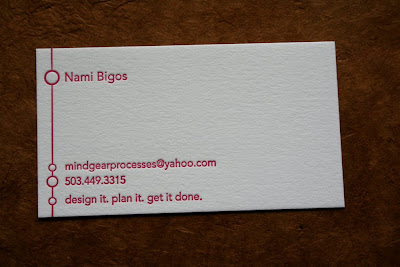
Calling Cards - Nami Bigos


Nami is a Portland, Oregon-based graphic designer who designed her own awesomely modern calling card and hired Twin Ravens Press to print them! I love how simple, professional and modern Nami's design is. It's clean, straight-forward, and totally down-to-business. These cards were printed in bright, rhodamine red ink (which, in all honesty, is really a bright magenta color), on crisp, 100% cotton, bright white Crane Lettra. Very nice!

. . . . . . . . . . . . . . . . . . . . . . . . . . . . . . . . . . . . . . . . . . . . . . . . . . . . . . . . . . .

Calling Cards - Evan Lally


Last, but certainly not least, are these fabulous calling cards, created for a good friend of mine, and self-proclaimed metro-sexual, Evan Lally. Evan's a pretty classy guy. He dresses super-snappy, lives in a very chic, downtown studio apartment in Eugene, and is just pretty much awesome. Evan's cards feature both modern and 19th century styling and typefaces, combined with a super-classy cherry blossom motif. These cards are vertically oriented and were printed in two metallic ink colors: silver and copper on 100 lb. Speckletone Wine cover stock, also from French Paper Company.

The cards feature the cherry blossom motif and Evan's name in a wood-type inspired typeface towards the top of the card, and his contact information in another classic typeface towards the bottom.


The center of the card features an oversized, bracketed tag line that is separated from the name and contact information by two stylish flourishes. We printed these cards with three different tag lines, which you can see in the top photo: "Totally Metro", "Not British, no really, I swear" and "Certified Show-Stopper".


I know that these tag lines may not mean anything to you, but trust me, if you knew Evan personally, you would understand. : )

. . . . . . . . . . . . . . . . . . . . . . . . . . . . . . . . . . . . . . . . . . . . . . . . . . . . . . . . . . .

If you enjoyed this little business and calling card round-up, check back again soon as I have many more 2009 calling cards to write about in the very near future!

If you would like more information about ordering calling or business cards of your very own, please feel free to contact me at any time!

I may not be blogging for the next few days, so to those of you who celebrate it, have a very Merry Christmas! Ta-ta for now!


Saturday, December 19, 2009

Tart Workshop + Twin Ravens Press Holiday Gift Tags


I recently had the opportunity to team up with the awesomely creative calligrapher/illustrator of Tart Workshop, Crystal Kluge, to design and letterpress print an absolutely adorable set of holiday gift tags. Crystal and I have had (and currently have) some mutual custom clients, so it was really exciting to get to work with her again on a project specifically for Tart Workshop & Twin Ravens Press!

These gift tags come in sets of six, one tag each of six different designs. All of the patterns were created by Crystal and all of the letterpress printing, die-cutting and assembly was done by Twin Ravens Press. These gift tags are 2.75" in diameter and feature a different pattern in one of four ink colors (red, green, copper or silver) on one side, and a place to write who the gift is to and from on the back side.


Each tag is tied with a piece of all-natural hemp twine, making them easy to attach to gifts or hang from a Christmas tree. The tag sets come packaged in a 100% biodegradable, clear, corn-cello bag.


Since we are releasing these tags so late in the season, we are offering you a very special deal on them! Visit the Twin Ravens Press Etsy Shop today or tomorrow and purchase $20.00 (or more) of our products (this can be single greeting cards, boxed sets, coasters, etc.) and receive one set of gift tags free with your purchase! This offer is only valid until tomorrow, Sunday, December 20th at 5:00 pm, Pacific Standard Time, or while supplies last, so head over to the shop now! If you just want the tags, that's perfectly fine too, they are also available for purchase on etsy, right here.

If you are currently a Twin Ravens Press retailer or you are considering carrying our products in your retail store, these tags will be added to our collection, and are available for wholesale purchases now. If you're already looking ahead for next year, keep these in mind, as they are super-cute!

If you'd like to check out more of Crystal Kluge's gorgeous hand-lettering, graphic design, illustration and typography design, check out her website and blog. I love working with Crystal, so check out her work if you have a custom project in mind!

Thanks so much again for the collaboration Crystal, and to all of my lovely readers out there: Happy Holidays and Happy Shopping!

Wednesday, December 16, 2009

Cardinals and Robots Featured this Week!


Two of our designs were featured this week in a couple of different places!


First off, our Robot with Heart Coasters were featured in an etsy treasury, entitled Robot Love, created by helengotlib. If you like robots as much as I do, you ought to go check out this feature, as all of Helen's robot picks are super-cute! Robot coasters make an awesome stocking-stuffer if you're still looking for something for that special someone. Place your order by this Saturday, December 19th for delivery by Christmas!


Secondly, our Cardinal greeting card was featured on Tapestry Design Studio today in a feature all about cardinals. There are some really great cardinal-themed picks there from greeting cards and art prints to jewelry, clothing and home goods. So, go check it out! Cardinal greeting cards are great for the holidays or any time of year! They are available in singles, sets of 6 or sets of 12 in our etsy shop! Happy Shopping!

Tuesday, December 15, 2009

Maria and Ashley are Getting Married!


I recently had the pleasure of working on a wedding invitation suite for a couple in Cali, Colombia! The couple is currently living in Florida, but they are having their wedding and reception this month in the bride's home town of Cali.

Way back at the beginning of this year (wow, almost a year ago already - yikes!), the bride, Maria, and I began working on a design for her save-the-date cards. Maria wanted her invitation suite to be formal and traditional, and warm and inviting all at the same time. We chose a very traditional layout and fonts for the design, and to warm things up, used a chocolate brown (rather than black or grey) ink for the printing. The save-the-date was an A6 size, which measured 4.5"x6.25". It came with a matching A6 size, white envelope with Maria's brother's return address in Cali, printed on the flap.


I absolutely love how decorative and beautiful a nice script face can be all by itself. Don't get me wrong, I love designing pretty images and patterns for wedding invitations as well, but there's just something about beautiful letterpress printed typography on white 100% cotton paper that brings joy to my heart. It's just so lovely!

Not too long after we did her Save-the-Date cards, we started working on the design for the main invitations. Maria wanted to continue with the gorgeous all-text design we had used for the save-the-dates for her invitations as well as keeping with the same fonts and ink color. Her main invitation suite included an A7 size invitation, an A2 size reception card, a 5" square map card and a beautiful set of inner/outer invitation envelopes. You can see a photo of the full suite at the top of this post and below is an image of just the invitation and invitation envelopes together.


For her invitation envelopes, Maria chose a matching set of white, A7 size envelopes with European pointed flaps from Waste Not Paper Company. We used the same address printing plate from her save-the-date card envelopes to print the return address on the flap of the outer invitation envelopes. The inner envelope was lined with a gorgeous, handmade paper from Nepal in a chestnut brown color. Maria hired one of my favorite calligraphers, Fran Heider of Little Flower Calligraphy, to calligraph her addresses on both sets of envelopes. I'm sure the calligraphy was absolutely lovely!


Above you can see the invitation all by itself. Maria explained to me that it's tradition in Colombia, and many other spanish-speaking countries, to include the parents names on the top of the invitation. I thought this was a really interesting tradition. Once again, I love the way the classic-looking script really accents and draws attention to Maria and Ashley's names in the center of the invite. I wish you could feel it too through your computer screen, because the texture of the letterpress impression feels amazing!


Maria and Ashley's reception card is an A2 size and featured the reception information, prominently in the center of the card and the phone number to RSVP to in the bottom left corner.


Isn't that a classy card?!? I love it!

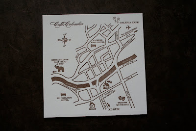
Creating a map for Maria and Ashley's wedding was somewhat of a challenge. It was surprisingly difficult to find an english map of the city of Cali (even google maps' map was in Spanish), and although I speak spanish fairly well, navigating a map of an unknown city, in a foreign language, while trying to locate certain streets and landmarks, was really challenging. Maria was awesome though and drew me a map of a little portion of the city that she wanted to use and I used that to create the map card design.


This map measures 5"x5" and was letterpress printed in chocolate brown ink. The thick dark line running through the center of the map is a river, the Rio Cali, and we created cute little icons (inspired by a map created by Crystal Kluge earlier this year for this wedding) to represent major city landmarks, the Catholic church where Maria and Ashley's wedding will be, their home, hotels they recommend, and for the reception location. Here is a close-up so you can get a better look:


I love the way this suite turned out and I know that Maria and Ashley's wedding in Colombia in a couple of weeks will be really neat! Congratulations Maria & Ashley!

Monday, December 14, 2009

Kate & Erick are Married!


First of all, I must send a huge thank you out to everyone who came and said "hi" yesterday at the Meet Your Maker Holiday Show. The show was a great success, and we had a much better turn out this time than at the one we did in November, so thank you to everyone who came!

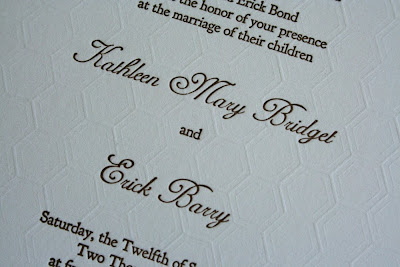
Next up, I have a really pretty and very unique wedding invitation suite from earlier this year to show off to all of you! This suite was created for a New York City couple, Kate and Erick, who were married this past September in Middletown, Connecticut. Kate desired a simple, yet elegant invitation that really took advantage of all that the letterpress process has to offer. What we came up with was a gorgeous, single-color, A7 size wedding invitation and a 4bar size reply card, both with extensive blind embossing, and a set of coordinating envelopes for both pieces. You can see all four pieces in this invitation suite in the photo above and below is the invitation all by itself.


When Kate originally hired me to design her invitation suite, she showed me the digital file she had created for her lovely save-the-date cards. Kate and Erick's save-the-dates featured a really fun and whimsical honeybee and honeycomb pattern as well as some lovely fonts. We chose to utilize fonts that were very similar to the ones on the save-the-dates and continue the bee and honeycomb theme for the main invitation suite. These invitations were printed in chocolate brown ink and featured the bee motif at the top and the invitation text below. We chose a traditional layout and used a pretty script face for Kate and Erick's names and the "Cocktails, dinner and dancing to follow" line at the bottom, and a classic, roman, serif face for the rest of the text. In order to incorporate the honeycomb pattern we blind embossed the entire background of the invitation with little honeycomb hexagons. Now, let me tell you, blind embossing a pattern this large over an entire sheet, was no small feat. In order to do this we had to pull each invitation manually on a cylinder letterpress (rather than doing the blind embossing on our platen press) and register each and every sheet by hand for the embossing. Despite the extra work that this took, the embossed pattern turned out beautifully and really gave this invitation design an elegant and rich texture! Here are some detail photos so you can see the fonts, impression and blind embossing a little better:


For the invitation envelopes, Kate chose a European pointed flap envelope from Waste Not Paper in sage green to accompany her invitations. We custom lined these envelopes with a slightly darker green liner that we had offset printed with a white honeycomb pattern. We then letterpress printed Kate and Erick's return address and another honeybee with a little flight path on the back flap of each envelope. Check it out:


Here is Kate and Erick's reply card and reply card envelope. For the envelope, Kate chose to stick with the sage green color and we letterpress printed the couple's address and a little bit of the honeycomb pattern in chocolate brown ink on the front.


The reply card itself featured some more honeycomb-pattern-blind-embossing on the left side of the card, and another little brown honeybee with flight path letterpress printed over the top of the blind embossing. The card featured a line for the guests to write their names and then a place for them to indicate which event(s) they would be attending. Kate and Erick planned a Friday night welcome and a Sunday morning brunch, as well as their wedding ceremony and reception, which was held on a Saturday. They also included a space where guests could write in a song that they would dance to at the wedding reception.

One of my favorite things about this reply card is the little hexagon-shaped check boxes we used for the different options guests needed to indicate. It's such a small detail, but I love the way it ties in with all of the blind-embossed pattern that we created! It really goes to show that taking extra special attention to detail when designing a piece can really add so much to the finished package. Here is another detail photo so you can see more of the gorgeous blind embossing and the sweet honeybee!


I love how gorgeous, elegant, sweet, whimsical, classic and unique this wedding suite is, all at the same time! Kate and Erick were fabulous clients to work with and I imagine that their wedding this past September was really beautiful and amazing!

Thanks so much and congratulations Kate and Erick! All the best to you!

One more note for today: this week is the last week to order holiday cards from our Etsy Shop. If you'd like to order holiday cards, please place your order by this Saturday, December 19th in order to receive them by Christmas! Happy Holidays!

Friday, December 11, 2009

Meet Your Maker Show & Sale this Sunday!


If you're in Eugene, Oregon this weekend come down to the Fenario Gallery at 881 Willamette Street on Sunday from 11-5 o'clock. Twin Ravens Press will be selling holiday greeting cards, gift tags and other goodies at the Meet Your Maker show, which will be our last public event before Christmas and for 2009. So, if you're going to be in town on Sunday, come down and check it out! There will be approximately 24 other vendors also selling fabulous holiday goods, as well as live music, food, drinks, an awesome raffle and other merriment! I hope to see you there!

Thursday, December 10, 2009

Henri-Lee and Konrad are Married!


Good morning, folks! It's time for another addition of "It's so cold in Oregon, all I can think about is wanting to be somewhere tropical". So, with no further ado, I present to you a lovely wedding invitation suite that I designed and printed last spring for a couple who live and were married in Honolulu, Hawaii. At the time that I began working with Henri-Lee and Konrad, I was actually working with another couple who was using their same wedding planner. The wedding planner's name is Alia Kennedy of Parasol Events in Honolulu, and she put me in touch with both lovely couples! We haven't actually met in person, but Alia is a true gem to work with, and I would highly recommend her if you are planning a destination wedding or a local wedding in Hawaii. When Alia contacted me about Henri-Lee and Konrad's wedding, we didn't have much time to design and print a totally custom suite. I listened to what Henri-Lee was envisioning though and described another suite I was currently working on for another couple, who you recently read about here, and we decided that we could create a similar suite that was adapted to better reflect Henri-Lee and Konrad's wedding without starting completely from scratch. You can see the four pieces in their invitation suite at the top of this post.

Henri-Lee and Konrad's suite included an A7 size invitation with corresponding envelope and a 4bar size reply card with corresponding envelope. The invitation was printed in three ink colors and the reply card was printed in one on Crane Lettra Pearl White 100% cotton paper. The envelopes were pink and yellow, were both printed in one ink color, and came from Waste Not Paper Company. Here is their invitation by itself:


As Henri-Lee and Konrad's wedding colors were pinks and yellows, we really wanted to somehow incorporate both and have a slightly tropical feeling to the suite. In order to do this, we adapted my birds in branches design to have the branches covered in pink plumeria flowers with four little yellow birdies on or flying up to it. If you haven't seen a plumeria in person, here is a photo of the real thing:


Plumerias are a tropical tree flower that come in a few different colors and are absolutely gorgeous! They smell amazing too! I actually have a small plumeria tree in my house that I brought back from Hawaii at one point. The tree is beautiful, but in the over 10 years that I've had it, it has never flowered. I'm thinking it might just be too cold here to do it, which is sad, but I'm still hopeful that one day it will. Anyway, back to the stationery!


We used a really gorgeous script font for the couples names and a classic serif typeface for the other invitation information. I absolutely love the way these crisp fonts and images combined with bright, cheerful ink colors really sink into the page! Gorgeous! The invitation was then paired with a coordinating yellow envelope and I letterpress printed their return address on the flap in chocolate brown ink.


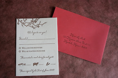
For Henri-Lee and Konrad's reply card we went with a similar coordinating design motif, this time without the birds and in only one ink color to save them some money. The reply card was printed in chocolate brown ink and featured a place for guests to write their names, check whether or not they would be attending, and then select their meal choice for the reception.


For the reception entree choices, we used some cute little caricatures (something I do fairly often) to represent fish, beef and vegetarian. The reply cards were paired with a bright pink envelope and again printed with the couple's address in chocolate brown ink.


Isn't this suite so sweet and beautiful all at the same time?!?

Since Hawaii is a fairly expensive and not very easy location to get to, Henri-Lee and Konrad planned a small wedding. Now, let's say that you're planning a small wedding and you invite just your closest friends and family to the actual event, but you also want to inform other friends of your nuptials. How do you do it? Send out wedding announcements! A wedding announcement isn't an invitation to the event and it is typically sent out after the couple is already married, but it is a nice, formal way to inform friends whom you don't necessarily want to invite to the event, or who you know won't be able to attend, that you were married. This is what Henri-Lee and Konrad did shortly after their wedding! Here is the announcement:


For this piece HL wanted to continue with the same sort of design that we had used for the actual invitation, but change up the size just a little bit. There was quite a bit of wording on their announcement, so in order to accommodate that without making the card look cluttered, we chose a long and skinny T-Length size. This card measures 3.875"x9.25" and was printed in three ink colors: chocolate brown, yellow and pink. It was paired with a coordinating, white, T-length envelope from Waste Not Paper Company and the return address was printed on the flap of it in pink ink. Here are some details of the announcement and announcement envelope so you can see the pretty fonts, images, ink colors and impression a little closer:


Aren't these lovely?!? It's such a nice way to announce your wedding to all of the people you couldn't invite, or who otherwise wouldn't have been able to make it to your actual event.

Once again, working with Alia of Parasol Events on this was absolutely wonderful and our clients, Henri-Lee and Konrad, were really sweet! Congratulations Henri-Lee and Konrad and thanks again!