Good morning, folks! It's time for another addition of "It's so cold in Oregon, all I can think about is wanting to be somewhere tropical". So, with no further ado, I present to you a lovely wedding invitation suite that I designed and printed last spring for a couple who live and were married in Honolulu, Hawaii. At the time that I began working with Henri-Lee and Konrad, I was actually working with another couple who was using their same wedding planner. The wedding planner's name is Alia Kennedy of Parasol Events in Honolulu, and she put me in touch with both lovely couples! We haven't actually met in person, but Alia is a true gem to work with, and I would highly recommend her if you are planning a destination wedding or a local wedding in Hawaii. When Alia contacted me about Henri-Lee and Konrad's wedding, we didn't have much time to design and print a totally custom suite. I listened to what Henri-Lee was envisioning though and described another suite I was currently working on for another couple, who you recently read about here, and we decided that we could create a similar suite that was adapted to better reflect Henri-Lee and Konrad's wedding without starting completely from scratch. You can see the four pieces in their invitation suite at the top of this post.
Henri-Lee and Konrad's suite included an A7 size invitation with corresponding envelope and a 4bar size reply card with corresponding envelope. The invitation was printed in three ink colors and the reply card was printed in one on Crane Lettra Pearl White 100% cotton paper. The envelopes were pink and yellow, were both printed in one ink color, and came from Waste Not Paper Company. Here is their invitation by itself:

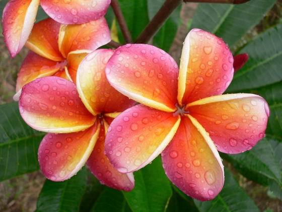
As Henri-Lee and Konrad's wedding colors were pinks and yellows, we really wanted to somehow incorporate both and have a slightly tropical feeling to the suite. In order to do this, we adapted my birds in branches design to have the branches covered in pink plumeria flowers with four little yellow birdies on or flying up to it. If you haven't seen a plumeria in person, here is a photo of the real thing:

Plumerias are a tropical tree flower that come in a few different colors and are absolutely gorgeous! They smell amazing too! I actually have a small plumeria tree in my house that I brought back from Hawaii at one point. The tree is beautiful, but in the over 10 years that I've had it, it has never flowered. I'm thinking it might just be too cold here to do it, which is sad, but I'm still hopeful that one day it will. Anyway, back to the stationery!


We used a really gorgeous script font for the couples names and a classic serif typeface for the other invitation information. I absolutely love the way these crisp fonts and images combined with bright, cheerful ink colors really sink into the page! Gorgeous! The invitation was then paired with a coordinating yellow envelope and I letterpress printed their return address on the flap in chocolate brown ink.

For Henri-Lee and Konrad's reply card we went with a similar coordinating design motif, this time without the birds and in only one ink color to save them some money. The reply card was printed in chocolate brown ink and featured a place for guests to write their names, check whether or not they would be attending, and then select their meal choice for the reception.

For the reception entree choices, we used some cute little caricatures (something I do fairly often) to represent fish, beef and vegetarian. The reply cards were paired with a bright pink envelope and again printed with the couple's address in chocolate brown ink.

Isn't this suite so sweet and beautiful all at the same time?!?
Since Hawaii is a fairly expensive and not very easy location to get to, Henri-Lee and Konrad planned a small wedding. Now, let's say that you're planning a small wedding and you invite just your closest friends and family to the actual event, but you also want to inform other friends of your nuptials. How do you do it? Send out wedding announcements! A wedding announcement isn't an invitation to the event and it is typically sent out after the couple is already married, but it is a nice, formal way to inform friends whom you don't necessarily want to invite to the event, or who you know won't be able to attend, that you were married. This is what Henri-Lee and Konrad did shortly after their wedding! Here is the announcement:

For this piece HL wanted to continue with the same sort of design that we had used for the actual invitation, but change up the size just a little bit. There was quite a bit of wording on their announcement, so in order to accommodate that without making the card look cluttered, we chose a long and skinny T-Length size. This card measures 3.875"x9.25" and was printed in three ink colors: chocolate brown, yellow and pink. It was paired with a coordinating, white, T-length envelope from Waste Not Paper Company and the return address was printed on the flap of it in pink ink. Here are some details of the announcement and announcement envelope so you can see the pretty fonts, images, ink colors and impression a little closer:


Aren't these lovely?!? It's such a nice way to announce your wedding to all of the people you couldn't invite, or who otherwise wouldn't have been able to make it to your actual event.
Once again, working with Alia of Parasol Events on this was absolutely wonderful and our clients, Henri-Lee and Konrad, were really sweet! Congratulations Henri-Lee and Konrad and thanks again!



 Posts
Posts